Copyright: National Gallery of Art: CC0 1.0
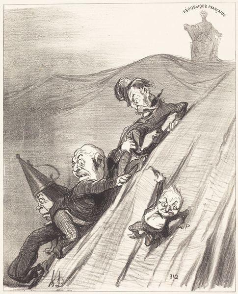
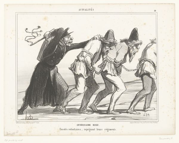
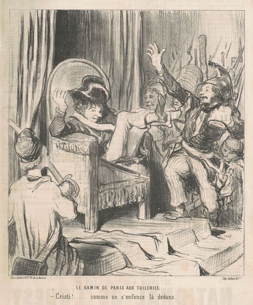
Editor: Here we have "Trois saints dans le même bénitier," or "Three Saints in the Same Holy Water Font," a lithograph print by Honoré Daumier from the 19th century. The caricature feels really biting; it's striking how the figures are crammed into this font, their expressions so exaggerated. What do you make of the composition, considering the artist's apparent intentions? Curator: Formally, the lithograph is fascinating in its exploitation of line and texture. The dense hatching creates a palpable sense of confinement, emphasizing the figures' restricted space. Daumier uses stark contrasts to draw the eye to specific features, such as the caricatured faces, thereby amplifying their satirical impact. Notice how the solidity of the font is rendered in relation to the frenetic energy above. Editor: So, it’s the formal elements themselves that are conveying the satire? I assumed some broader context would be required. Curator: The pointed hats they wear contribute to the visual rhetoric of the image. The shapes echo and reinforce the visual discord within the composition itself, irrespective of external allusions. Look closely; each formal choice serves to undermine any sense of sanctity. Even the inscription, a seemingly innocuous devotional phrase, is rendered ironically through its placement within this chaotic composition. Is it not in the service of contrasting meaning to its location? Editor: I see what you mean. The close inspection highlights how Daumier used simple techniques to express profound sentiment. The artist controls my reading, in essence. Thank you for guiding my understanding! Curator: A fruitful application of our time indeed, providing greater respect for the intentionality of such careful constructions of visual metaphor.
Comments
No comments
Be the first to comment and join the conversation on the ultimate creative platform.
More like this