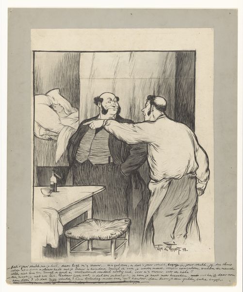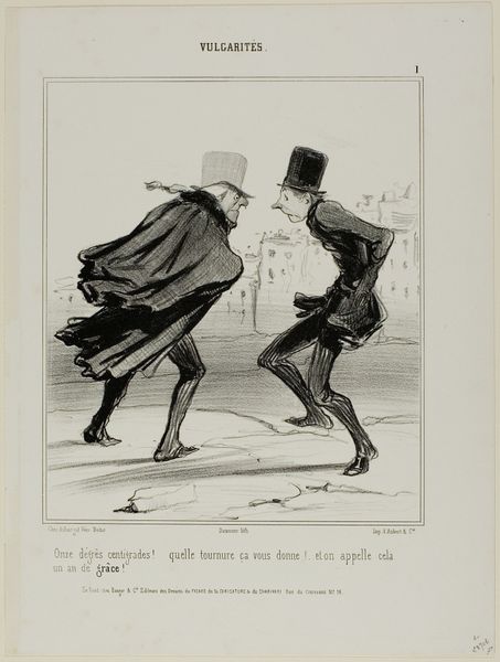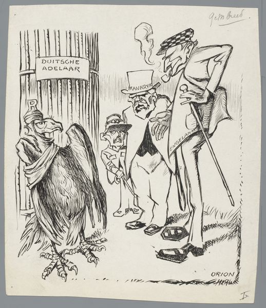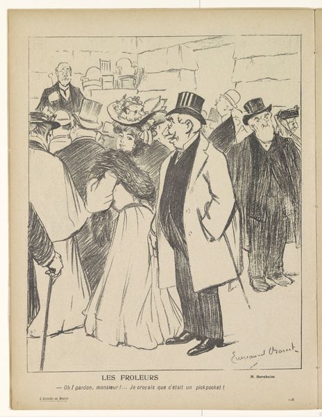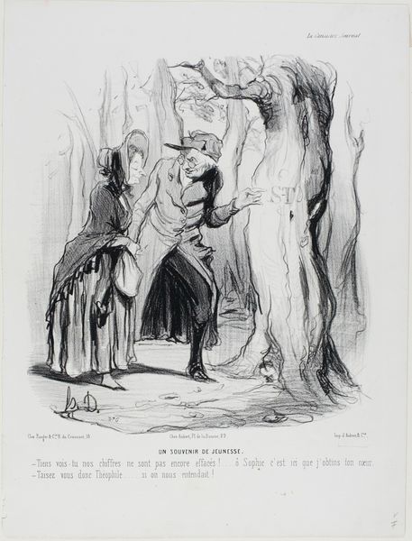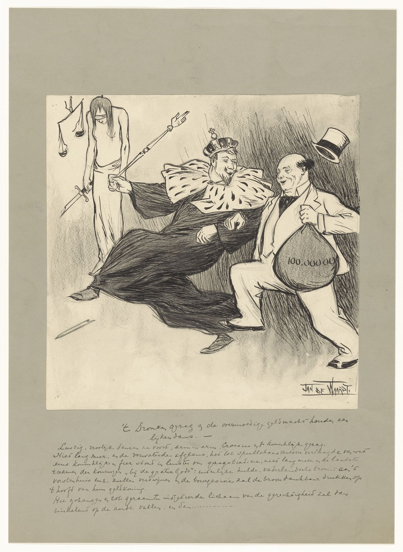
1875 - 1900
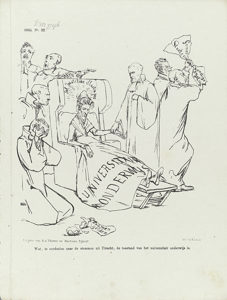
't Dronken gezag en de overmoedige geldmacht houden een lijkendans
Jan de Waardt
1871 - 1909Location
RijksmuseumListen to curator's interpretation
Curatorial notes
Editor: This is an intriguing ink drawing titled "'t Dronken gezag en de overmoedige geldmacht houden een lijkendans," created sometime between 1875 and 1900 by Jan de Waardt. The caricature style gives it an unsettling yet darkly humorous mood. What strikes me is the way the artist uses stark contrasts in the shading to almost stage the figures. How do you interpret this work? Curator: The potency of this piece resides primarily in its compositional arrangement. Observe how the artist positions the three figures – drunken authority, corrupt wealth, and Lady Justice – to direct the eye across the plane. The diagonal momentum pulls the viewer from the impartial, though perhaps ineffectual, justice towards the chaotic dance of power and greed. Editor: I notice Lady Justice seems detached, while the other figures are dynamic and intertwined. Is this purposeful? Curator: Precisely. The formal element of line contributes significantly. Note the frenetic, almost scribbled lines that define the figures of authority and wealth versus the static, clean lines of justice. This deliberate contrast in linework serves to emphasize the corruption and disarray caused by their actions, with a sobering effect achieved by Lady Justice's form. It subtly highlights the imbalance of power. Editor: So, it is the visual arrangement of the artwork's elements that underscore the themes of justice and corruption? Curator: Yes, by focusing on the interplay of line, form, and composition, the drawing allows the viewer to critically consider this interplay of corruption versus authority in what we might see as the timeless performance of such imbalances. It compels the audience toward critical reflection. Editor: I appreciate the focus on the visual. Thinking about the work as a stage for these relationships really clarifies its message for me. Curator: Indeed. The absence of color underscores the gravity. And perhaps a commentary on a kind of formal "purity," something ironically devoid in their 'dance'.