drawing, paper, pen
#
drawing
#
comic strip sketch
#
quirky illustration
#
quirky sketch
#
pen illustration
#
pen sketch
#
paper
#
personal sketchbook
#
geometric
#
pen-ink sketch
#
sketchbook drawing
#
pen
#
storyboard and sketchbook work
#
sketchbook art
Dimensions: height 169 mm, width 217 mm
Copyright: Rijks Museum: Open Domain
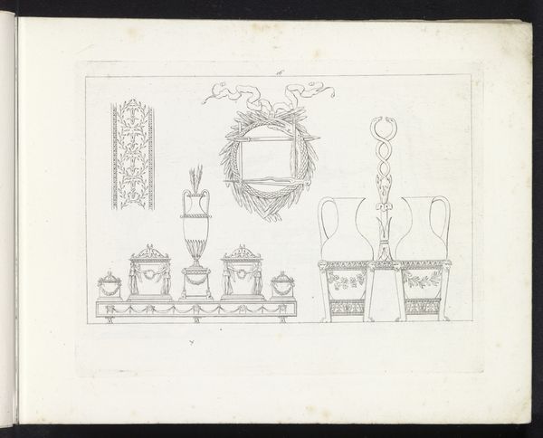
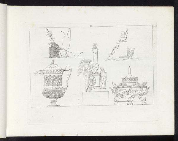
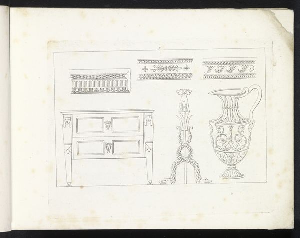
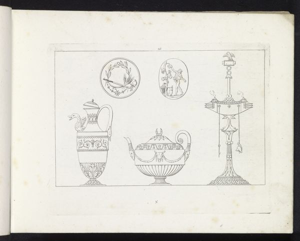
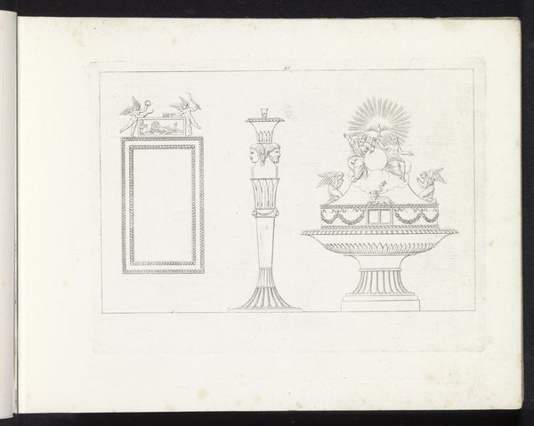
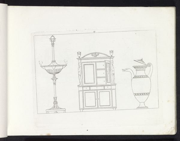
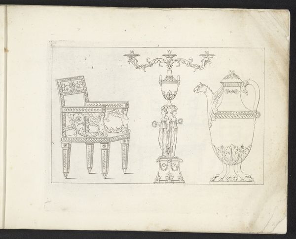
Curator: This intriguing pen drawing on paper is entitled "Doorvont, een oliebrander en een stoel," or "Baptismal font, an oil lamp and a chair" created in 1817 by Pietro Ruga. It offers a peek into the artist's personal sketchbook. Editor: The austere precision immediately grabs me. The fine linework, almost like an architect's blueprint, has a stark, detached quality, don't you think? Curator: Indeed. But perhaps, beneath that surface lies a deeper critique of early 19th-century societal values, especially those relating to domesticity and rituals. The baptismal font, the oil lamp, and the chair, objects signifying life, illumination, and comfort—all presented with this calculated formality—it points to how lived experience was mediated by structures and traditions. Editor: Interesting! I see how that might point towards lived experiences in a wider historical context. Still, the pure composition is remarkable. Ruga meticulously delineates each form, giving prominence to the chair with the mythical creatures. Their symmetry and their curves echo throughout the drawing. Curator: That's a wonderful point. It resonates with the period’s fascination with classical motifs, linking ideas of reason and civilization to the establishment and fortification of a new post-Napoleonic order. The chair, almost resembling a throne, subtly indicates an entrenched hierarchy of power. And, that power is divinely ordained! Editor: Yes, the way he renders the objects creates this compelling dynamic. But beyond the symbolic interpretations, note the masterful balance in composition. Each element, from the stark white background to the controlled linework, emphasizes a unique design style and its form. It shows control! Curator: And perhaps a critique of control as well! Consider how each item has been removed from any real lived context, essentially dehumanized by the artist’s dispassionate eye. Each detail has its place, emphasizing, ironically, the potential social artificiality hidden beneath concepts like ‘divine illumination' or the supposed comfort of the home. Editor: Hmmm… So, while I was enjoying the purely aesthetic harmony, you read in the critique of 19th-century domesticity. Curator: Art reflects its surrounding world, doesn’t it? Editor: As does how we read it today, which is so powerful. Curator: Precisely. An important moment, indeed.
Comments
No comments
Be the first to comment and join the conversation on the ultimate creative platform.
More like this