painting, acrylic-paint
#
op-art
#
painting
#
op art
#
pop art
#
colour-field-painting
#
acrylic-paint
#
geometric
#
geometric-abstraction
#
pop-art
#
line
#
modernism
#
hard-edge-painting
Copyright: Howard Mehring,Fair Use
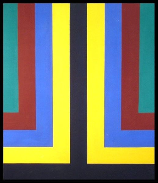
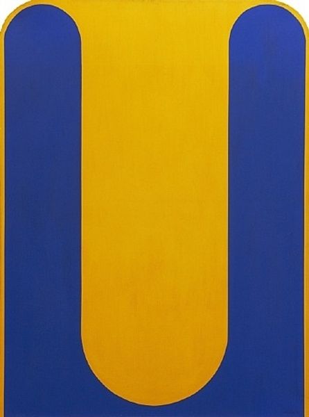
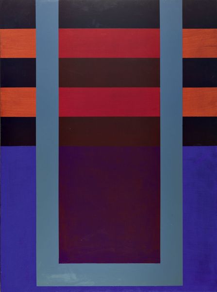
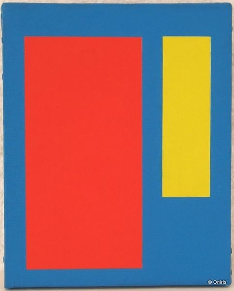
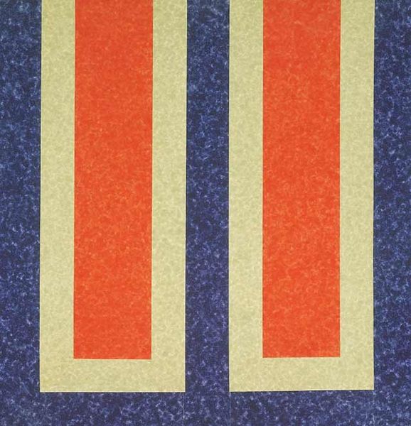
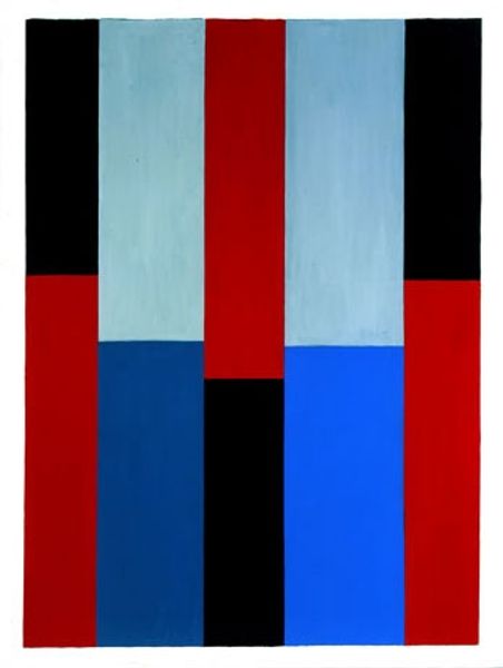
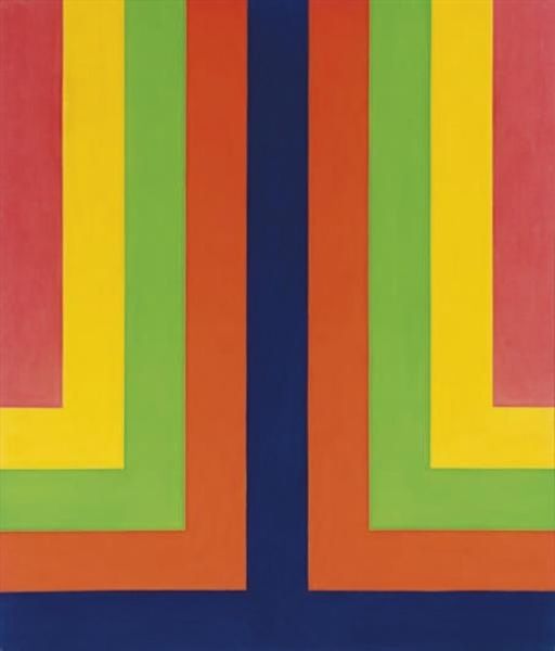
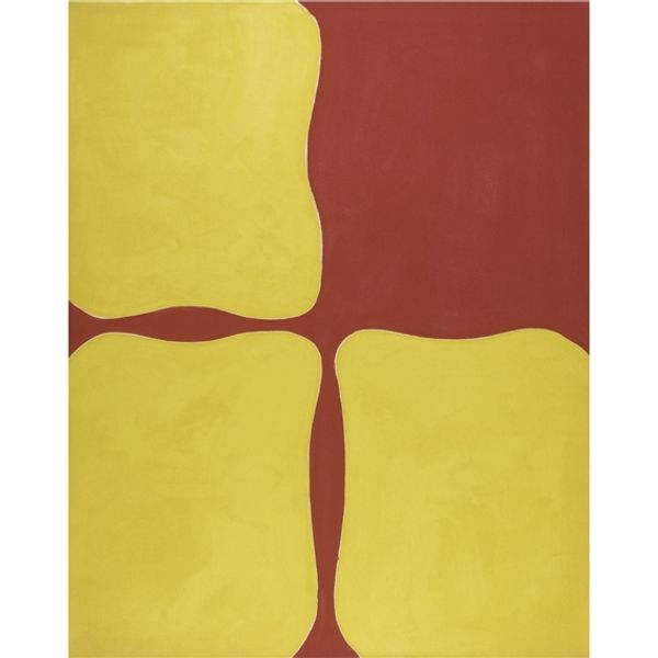
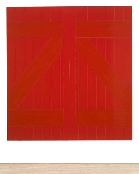
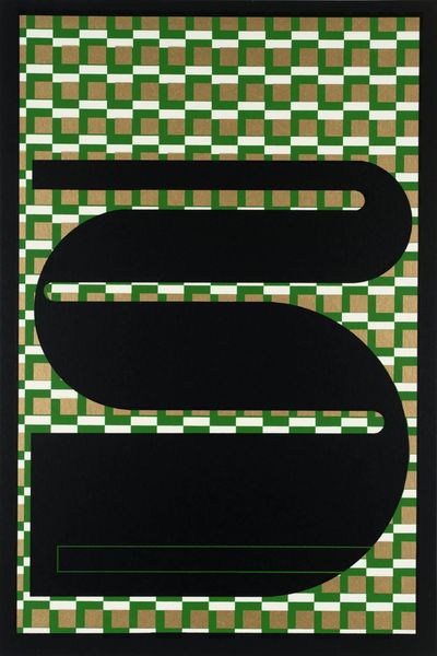
Curator: Before us is an Untitled piece by Howard Mehring, executed in 1964. It’s acrylic on canvas. What do you make of it? Editor: It hits you immediately with a stark geometric simplicity, doesn't it? Three colours, bold shapes. The primary triad is rather attention-grabbing. The eye jumps to each color and shape almost randomly, as it's organized somewhat symmetrically. Curator: It is. This work comes from Mehring's exploration of Color Field painting and the Hard-Edge movement. We can read the black as providing a ground. Editor: And it is, literally, grounding the bright colors. The yellow advances, the red recedes a bit... There's a push and pull effect, and the hard-edged forms emphasize the flat picture plane. There’s very little depth being shown here. How does this formal structure communicate anything to you? Curator: Well, beyond its purely visual appeal, I believe there's a reflection of the mid-century modern aesthetic – clean lines, an optimism tied to industrial and technological advancements, even hints of minimalist architecture taking root. The almost hieroglyphic nature is reminiscent of ancient glyphs representing building layouts and locations in urban centers, though rendered in these futuristic tones. Editor: Interesting association. Do you think that's intentional? Curator: Probably not explicitly, but artists are always embedded in their cultural context. These shapes trigger memories and patterns; he makes choices, reflecting not just color theory, but cultural currents of his time as well. It brings forth an organized vision of space and order. Editor: Perhaps. Regardless of intention, it offers an intriguing visual experience. Even the small variations in the planes and the textures within those uniform blocks become increasingly important through extended observation, right? Curator: Yes. You begin to appreciate the micro details and perhaps the painting’s macro symbolism. Even in abstraction, artistic intention and interpretation blend, so that any symbols or intention that come to mind when observing it might not be universal, but can still feel very appropriate or close-fitting. Editor: Agreed. There’s power in allowing these interactions to emerge spontaneously in art. Curator: Indeed. A dance between visual structure and symbolic meaning. Editor: A very chromatic one at that.
Comments
No comments
Be the first to comment and join the conversation on the ultimate creative platform.
