Copyright: Pat Lipsky,Fair Use
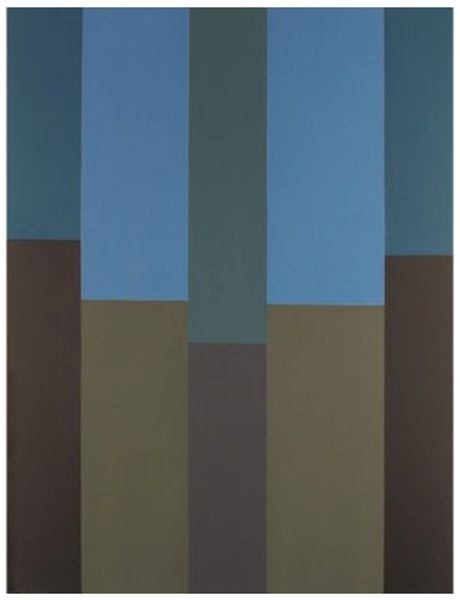
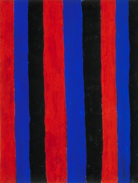
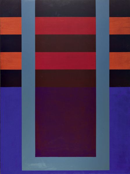
Editor: We're looking at "Red River Valley #1" by Pat Lipsky, made in 2003 using acrylic paint. At first glance, it's these stark blocks of colour—reds, blues, blacks—arranged in this grid that kind of throws me. It feels almost…musical? What do you make of it? Curator: Musical, that’s interesting. It does have a rhythm to it, doesn’t it? It’s very Colour Field, very Hard-Edge. Lipsky, you see, she's stripping painting down to its absolute essentials: colour and form. Do you think the title influences how you see the painting? Editor: Possibly! "Red River Valley" conjures a sense of landscape, even though there isn’t a literal one depicted. Maybe that's why I perceive musicality? Like flowing water or distinct notes? Curator: Exactly! The feeling overrides depiction. These colours, the way they butt up against each other... it creates a tension. And yet, there's a balance, too. Is there anything that makes the painting “good” or "bad" in your perspective? Editor: That balance is interesting. The tension keeps me engaged, it is an aesthetic experience! Maybe I came expecting representation, so the starkness initially felt…jarring? Now, I’m enjoying how those simple blocks communicate so much! Curator: That’s what abstraction is all about – opening yourself up to possibilities beyond representation. It’s a visual poem. Or, as you beautifully suggested, a melody waiting to be heard. I learned from you. Editor: Same here, I had my doubts but I ended up with a new perspective on abstraction.
Comments
No comments
Be the first to comment and join the conversation on the ultimate creative platform.