#
pattern
#
colour-field-painting
#
geometric
#
abstraction
#
line
#
hard-edge-painting
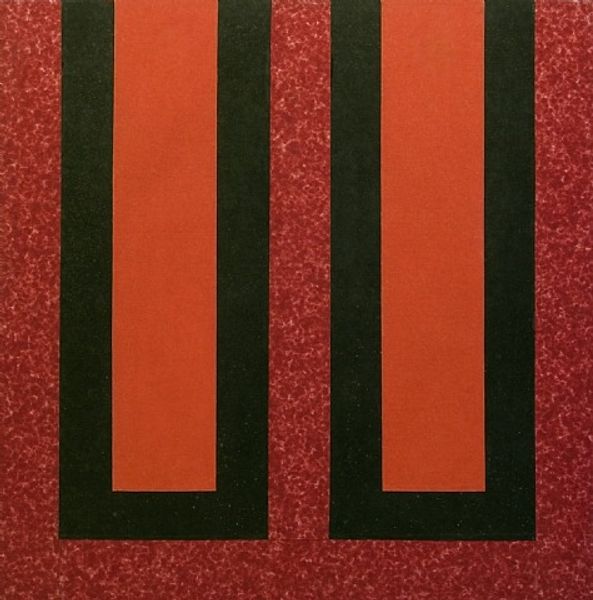
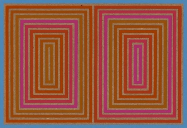
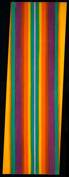
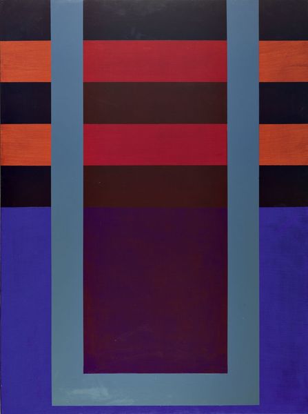
Dimensions: 190.5 x 187.96 cm
Copyright: Howard Mehring,Fair Use
Editor: We're looking at "Double Red," created by Howard Mehring in 1963. It's currently housed in the Phillips Collection. This piece is striking because of its boldness; the colours really pop against that speckled blue background. What are your thoughts when you look at this piece? Curator: What interests me immediately is its context within the Washington Color School. These artists were reacting against the gestural abstraction of the New York School, creating paintings characterized by large fields of flat colour. Consider the social climate – this was during the Civil Rights movement. Could the hard edges and simplified forms be seen as a desire for clarity and order amidst societal upheaval? How might the museum, as a traditionally conservative institution, have shaped the reception of such a work in the '60s? Editor: That’s a really interesting point about the socio-political backdrop! I hadn’t considered that. So the lack of obvious brushstrokes, is that a political choice, maybe? A deliberate break from the individualistic style that came before? Curator: Exactly! The very act of removing the artist’s hand becomes a statement. It moves the emphasis away from personal expression and perhaps towards a more universally accessible visual language. The institutional validation – or lack thereof – also played a huge role. Who decides what gets displayed and remembered shapes our understanding of art history. What effect do you think colour choice has on a modern audience viewing the art in a museum today? Editor: Hmm, the red, white and blue combination has definitely been recontextualized in so many different ways throughout recent history, especially politically... It's easy to miss those historical contexts, but they really affect how a viewer receives it. Curator: Precisely. Looking at "Double Red" today, understanding its original social and institutional contexts provides a much deeper appreciation of the artistic choices Mehring made. Editor: I agree. Thanks so much! Now I see it’s way more than “just” colors and shapes. Curator: Indeed! Hopefully that perspective helps you see all art a little bit differently moving forward.
Comments
No comments
Be the first to comment and join the conversation on the ultimate creative platform.
More like this