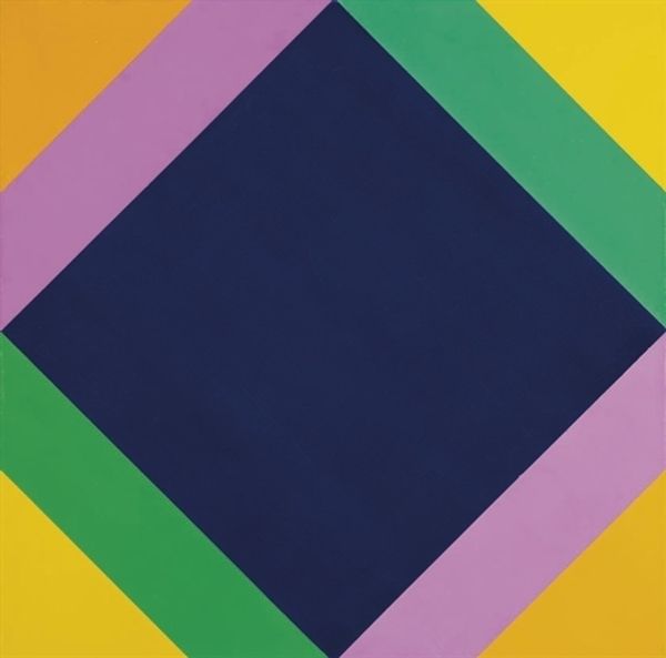
acrylic-paint
abstract-expressionism
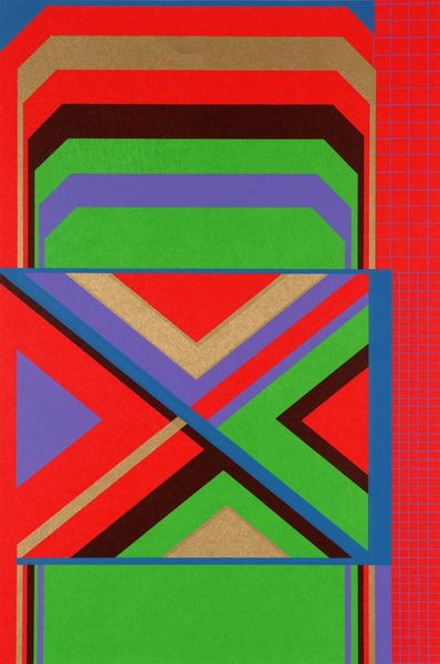
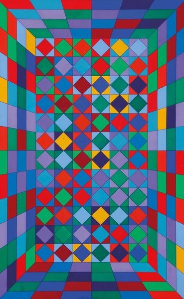
pattern
op art
pop art
colour-field-painting
acrylic-paint
geometric pattern
geometric
pop-art
line
hard-edge-painting
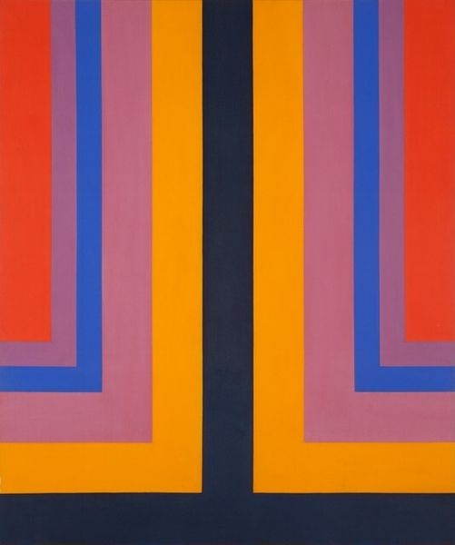
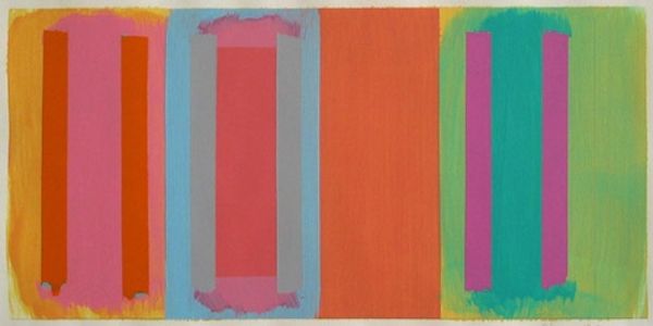
Copyright: Howard Mehring,Fair Use
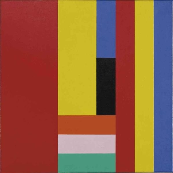
Curator: Howard Mehring's "Chroma Double," painted in 1965, confronts us with a symmetrical field of intensely bright colours in acrylic on canvas. My immediate reaction is how optimistic it feels, like a vibrant invitation. What stands out to you? Editor: There’s a stark formality to its structure. The symmetry and the pure, unmodulated color fields remind me of heraldry or perhaps signal flags – codes meant to be read. The deep blue is like a central spine that holds the chromatic reverberations. Curator: It’s interesting you mention codes. For me, it touches on that period's experimentation with perceptual psychology. It plays with how the mind interprets color relationships and spatial depth. Look at how the bands recede, almost pulling you in, even though it's completely flat. Could it be seen as a reflection of the technological optimism of the '60s? Editor: The visual language is undoubtedly clean and precise. It speaks to the cultural shift towards industrial production, mass media, and a general fascination with technology. You can definitely relate this to Hard-Edge Painting or even Op Art which became so popular at the time. I wonder if the colours used here mirror any specific events of 1965, since colours often reflect social dynamics in certain cultures. Curator: It's fascinating to view it through that lens. But in abstract work, there is a more personal psychological depth—how color impacts the individual spirit, harking back to symbolic traditions we find cross-culturally. Think about it – green is life, yellow joy, red energy. Mehring creates a harmonic convergence right before our eyes! Editor: A harmonic convergence… perhaps. What I keep coming back to is its presentation, the context in which this piece first appeared, and how it was perceived. Did its bright geometry suggest a new, optimistic vision for American society? I suppose these colours might have offered an escape in times of political change and anxieties, providing a sense of control and order on a canvas. Curator: Regardless of whether we perceive this through the historical events of the time, or the universal symbolic understanding, this certainly has the capability to stir emotions. Thank you for adding an additional dimension, Editor. Editor: The pleasure was mine. It's often the push and pull between the historical and the personal that makes encountering art such a compelling endeavor.
Comments
No comments
Be the first to comment and join the conversation on the ultimate creative platform.