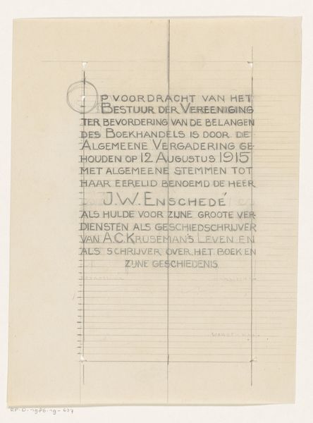
Visitekaartje van boekhandel en antiquariaat Das Graphische Kabinett van Israel Ber Neumann te Berlijn en Baden-Baden before 1925
drawing, graphic-art, print, poster
drawing
graphic-art
aged paper
script typography
old engraving style
hand drawn type
hand-drawn typeface
fading type
thick font
handwritten font
golden font
poster
historical font
Dimensions: height 80 mm, width 123 mm
Copyright: Rijks Museum: Open Domain
This is a business card by Franz A. Peffer for a bookshop in Berlin and Baden-Baden. Look how the image is built up with lots of tiny marks, like a collage of lines and dots. It reminds us that art isn’t about perfectly copying something, but more like a process of building, layering, and finding your way. Notice the shelves overflowing with books, rendered in short, scratchy lines. They create a kind of controlled chaos, don't they? It's like Peffer is saying that art, like a good bookstore, should be full of surprises. Then you have the figures who are drawn with a similar kind of directness, a man carrying a pile of books that looks precarious and heavy. For me, Peffer’s mark-making has something in common with the work of Paul Klee, a contemporary of his, who used simple marks to create complex, dreamlike worlds. With this card, Peffer invites us into the world of books and art, suggesting that both are about exploration, imagination, and a little bit of delightful disorder.
Comments
No comments
Be the first to comment and join the conversation on the ultimate creative platform.