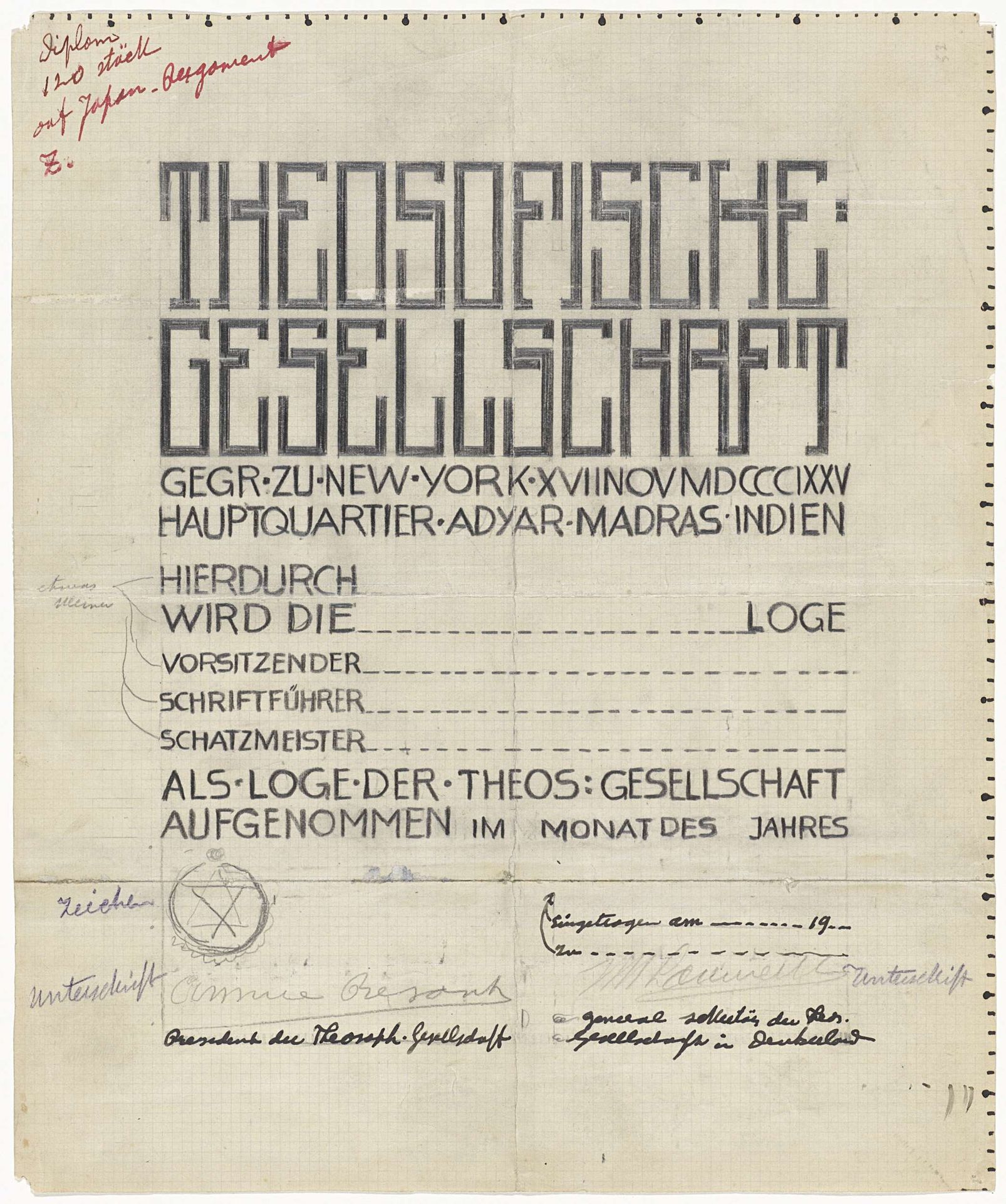
1874 - 1932
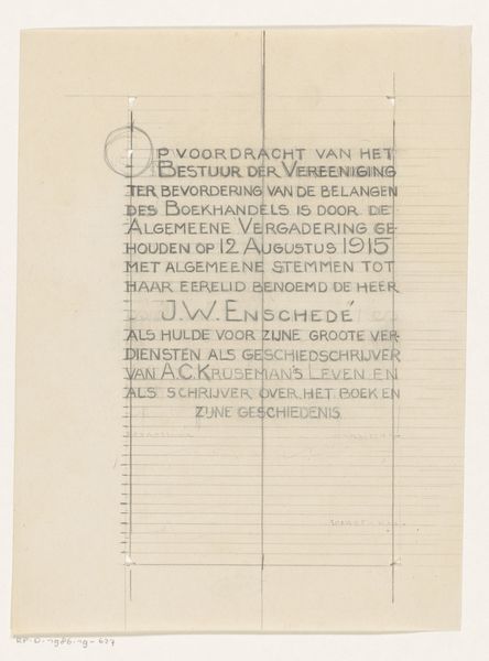
Ontwerp voor een diploma van de Theosofische Gesellschaft
Listen to curator's interpretation
Curatorial notes
This 'Ontwerp voor een diploma van de Theosofische Gesellschaft' is an ink drawing on paper by Mathieu Lauweriks. It's difficult to know precisely when, but probably sometime in the early 20th century. The letters of the title are built from these solid architectural blocks. The letters are dark and bold, but they're also very open and feel incomplete, like you could just keep going and build more. It feels almost like a blueprint. I keep thinking about Sol LeWitt wall drawings. Look at the texture of the paper and the handmade quality of the marks. It's so different from our sleek digital world. The smudges and corrections are beautiful. It reminds you that design isn’t about perfection, but about process. There are all these little notes in the margins, the artist is thinking and working through the problem right there on the page. It becomes this incredibly human and intimate document.