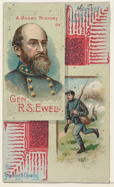
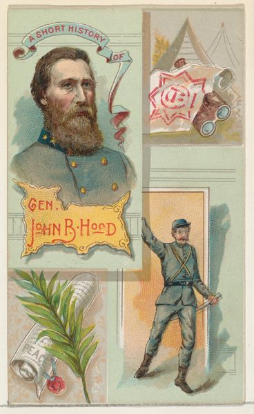
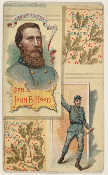
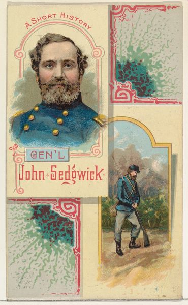
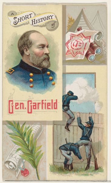
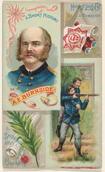
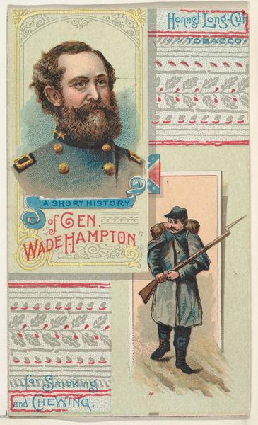
A Short History of General Richard Stoddart Ewell, from the Histories of Generals series (N114) issued by W. Duke, Sons & Co. to promote Honest Long Cut Smoking and Chewing Tobacco 1888
0:00
0:00
drawing, coloured-pencil, print
#
portrait
#
drawing
#
coloured-pencil
# print
#
coloured pencil
#
men
#
genre-painting
#
history-painting
Dimensions: Sheet: 4 3/16 × 2 1/2 in. (10.7 × 6.4 cm)
Copyright: Public Domain
Editor: This is a print from 1888, titled "A Short History of General Richard Stoddart Ewell," part of a series promoting tobacco. It features a portrait and an action scene using colored pencil. It's quite small and the composition seems...unusual, almost fragmented. What formal elements stand out to you? Curator: Indeed. Note how the image is structured. The subject's bust occupies the primary field, but it is compartmentalized beside botanic forms and a skirmish scene. This adjacency encourages the viewer to make connections. How does the contrast of stasis and motion influence the overall reading? Editor: That's interesting. I hadn't thought about the stillness of the portrait versus the implied movement in the battle scene. What’s the significance of these contrasts? Curator: The work invites us to parse the relationship between public image and historical narrative. How does the symmetry, or lack thereof, affect the viewer's engagement? Is there a suggestion, in the composition itself, about the fragmentation of memory and the constructed nature of historical narrative? Editor: It feels disjointed, definitely not a straightforward story. So the asymmetry highlights the idea that history isn’t neat and tidy? Curator: Precisely. Note the tonal values and consider their effect. How do the light pastels serve to convey or subvert notions of gravitas and militaristic might? Consider, too, the effect of colour- the delicate lavenders and soft greens with those more stark and direct golds, silvers, blacks... Editor: It’s interesting to consider how the formal aspects work together to suggest meaning and subvert our initial assumptions about this work. Thanks, that really helps clarify things! Curator: A fruitful analysis. A rigorous approach such as this allows us to access multiple possible readings of such complex cultural materials.
Comments
No comments
Be the first to comment and join the conversation on the ultimate creative platform.
More like this