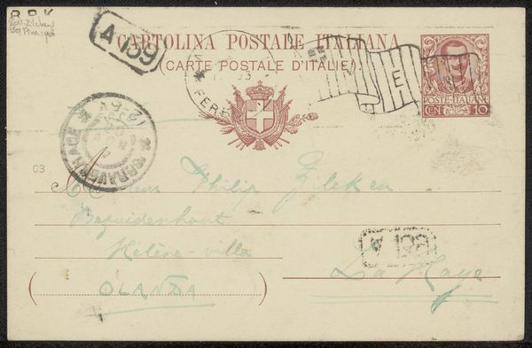
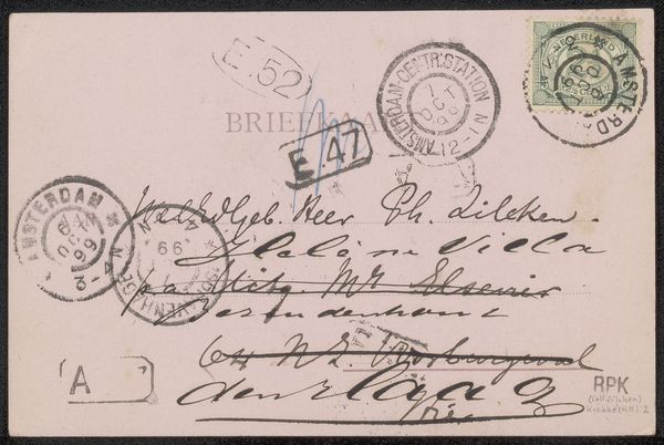
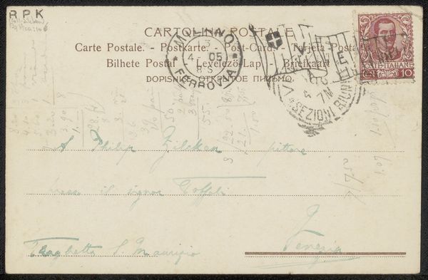
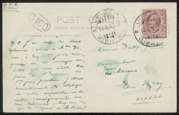
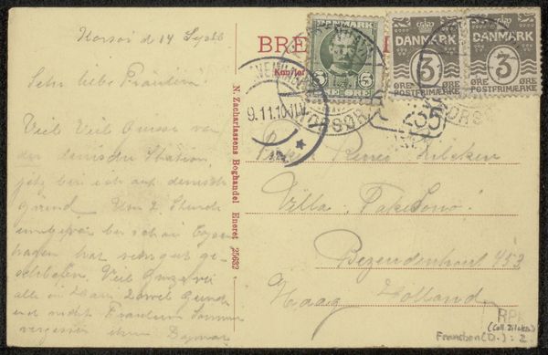
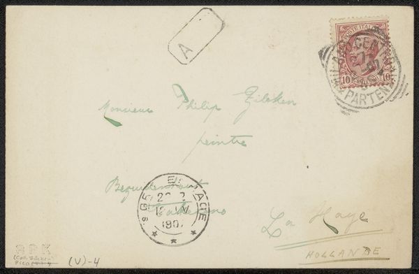
drawing, ink
#
drawing
#
ink
#
calligraphy
Copyright: Rijks Museum: Open Domain
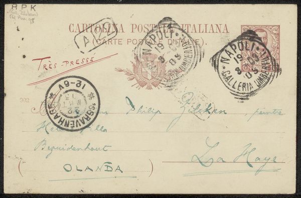
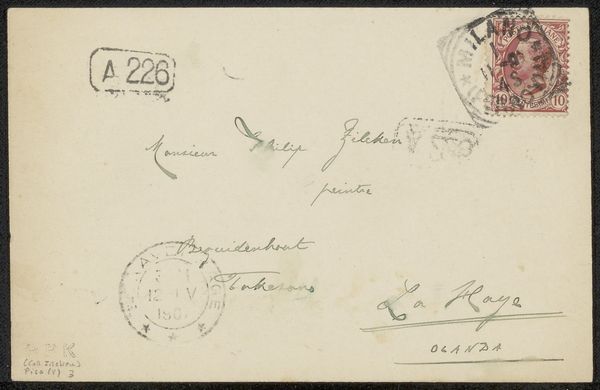
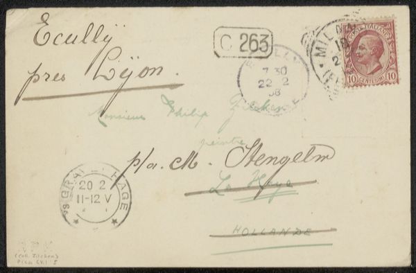
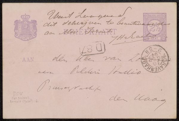
Editor: This is a postcard titled "Briefkaart aan Philip Zilcken," believed to have been made sometime between 1904 and 1915. It's a drawing in ink. The first thing that strikes me is how the handwriting interacts with the postal markings, almost creating layers. What compositional elements stand out to you? Curator: Indeed, observe the strategic interplay between the formal elements of calligraphy and the super-imposed marks. Notice how the linear progression of the address is interrupted, almost punctuated, by the circular stamps. How does this interruption affect the spatial dynamics of the piece? Editor: It makes the surface feel less like a pure writing space and more like a textured field. Like the stamps become abstract shapes within the overall composition. The tension is between information and…pattern, almost? Curator: Precisely. The overlapping inks – notice the contrasting densities and directions – flatten the image, prioritizing surface articulation over illusionistic depth. The cancellation marks and postage introduce a readymade element, disrupting conventional pictorial space. Does that shift your perspective at all? Editor: Absolutely. I’m used to thinking of drawing in terms of creating an image. Here, the ink serves less to depict and more to just *be*. It exists on the surface of the card itself. So the process of adding the markings on it is part of its message. It makes me reconsider the definition of ‘drawing.’ Curator: A rewarding interpretation. This challenges established boundaries, foregrounding the material presence and conceptual function over purely aesthetic representation. It highlights that artistic interpretation transcends subject matter, existing instead in spatial relationships. Editor: I see it in a totally different way than when we began! Thanks so much for explaining.
Comments
No comments
Be the first to comment and join the conversation on the ultimate creative platform.
More like this