drawing, paper, ink, pen
#
portrait
#
drawing
#
pen sketch
#
hand drawn type
#
hand lettering
#
paper
#
personal sketchbook
#
ink
#
ink drawing experimentation
#
pen-ink sketch
#
ink colored
#
pen work
#
sketchbook drawing
#
pen
#
sketchbook art
Copyright: Rijks Museum: Open Domain
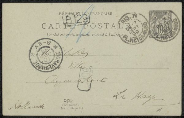
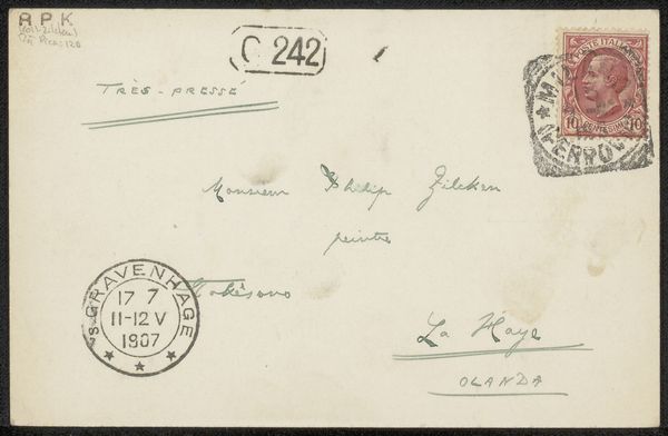
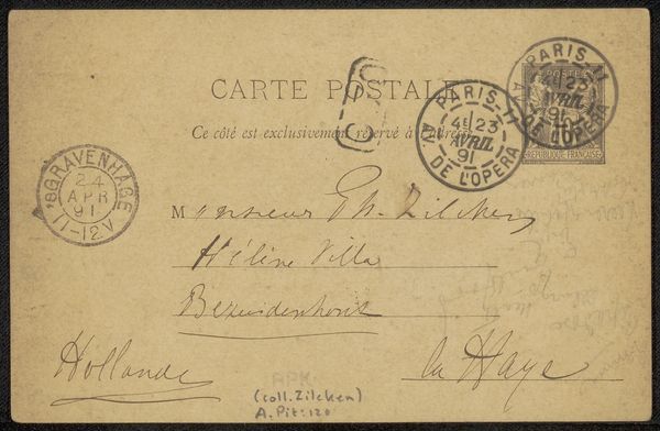
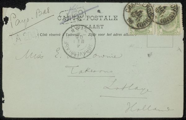
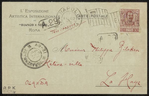
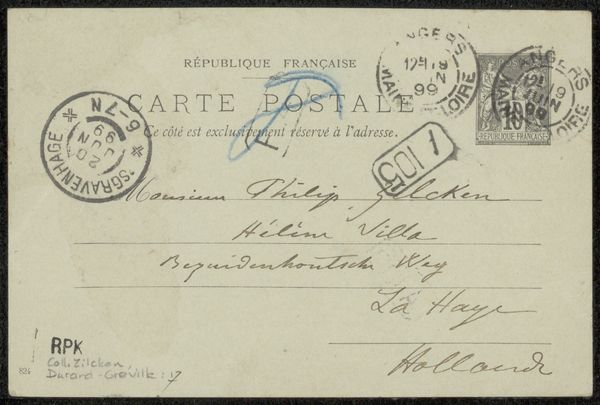
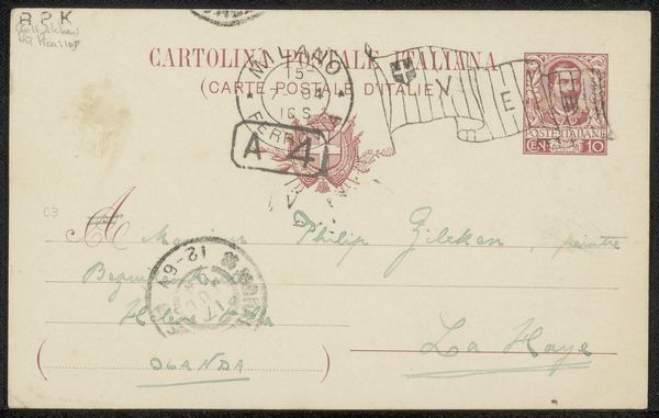
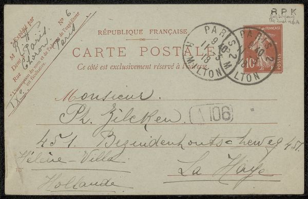
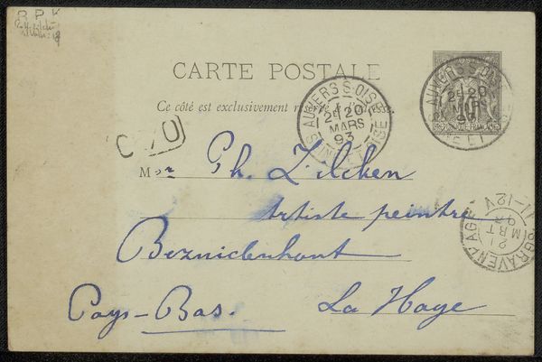
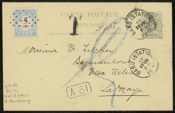
Editor: We’re looking at a postcard, "Briefkaart aan Philip Zilcken," possibly from 1905. It's ink and pen on paper, with some added stamps and postal marks. The handwriting and different scripts give it a layered feel. What strikes me is how ephemeral and fragile the piece seems, and I’m wondering how you interpret its visual aspects? Curator: The power here lies in its layered presentation. Consider the interplay between the planned printed words – the standardized postal greetings in multiple languages, forming an organized block – against the personal script of the message itself. Observe the rhythm established by the handwriting, its variable pressure creating a dance of line and form. Even the obliteration by postal stamps contributes to the piece's aesthetic texture. Editor: So, it's less about what the message *says* and more about *how* it's visually communicated? Curator: Precisely. The superimposition of text and stamps alters the legibility, moving us from practical communication to visual contemplation. The medium of ink lends a certain finality, yet the postcard remains a fleeting, transient object, passed through many hands. Are you struck by the stamp itself and the message next to it? Editor: Now that you point it out, the density of that area definitely stands out with the faded portrait on the stamp. It really accentuates that particular space. Curator: Yes, and consider that a stamp’s design elements – portrait, typography, denomination – contribute another layer of intended meaning and graphic quality, existing alongside and competing with the spontaneous markings of the sender. What's also unique here are the colors. Do the faint greenish pencil lines add a certain element to the composition in your eye? Editor: Yes, absolutely, the different ink densities create movement on the paper and emphasizes certain phrases. I suppose I hadn't considered how much information is actually embedded in the ink and placement alone. Curator: And that visual richness far transcends the basic function of the postcard, highlighting the art in everyday communication. It showcases how the deliberate choice of layout can change one's viewing of the postcard.
Comments
No comments
Be the first to comment and join the conversation on the ultimate creative platform.
More like this