Copyright: Charles Bezie,Fair Use
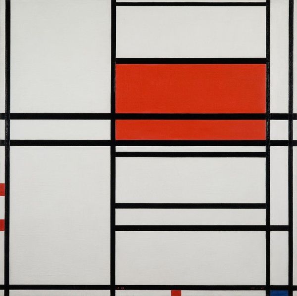
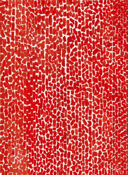
Editor: So, this is "Nr. 1240" by Charles Bezie, from 2001, done in acrylic and ink. It strikes me as intensely ordered, almost obsessively so. It is minimalist but there is depth through the shades and surface. How do you interpret this work, and especially its very strict composition? Curator: That rigid structure you observe is crucial. We have to consider the historical context of hard-edge painting and geometric abstraction, art movements that consciously rejected the expressive brushstrokes of Abstract Expressionism. This piece pushes us to question what “freedom” means within those self-imposed boundaries, and who is granted the space to express freely in any socio-political setting. What do you feel the singular color tells us about its purpose? Editor: I didn’t even realize it was part of a wider movement but the restriction seems even more prominent now. To be honest the blocks of flat red make it almost graphic like the bold red we see used on political campaigns, almost reminiscent of agitprop and social posters but more subtle, almost internalized, thoughts? Curator: Exactly! And considering Bezie's body of work we can examine the color red not just aesthetically, but politically. It can be linked to themes of power, warning, even resistance. How might an artist use such a charged color to speak about institutional power, especially in post-Cold War Europe? Are those rigid blocks echoing the rigid structures we encounter daily? Editor: That’s fascinating; I hadn't considered that. Thinking about those structural resonances definitely shifts my perception. Curator: It makes us question how simple forms and colors can convey complex societal ideas. The beauty of art history is revealing these kinds of contextual layers, don’t you agree? Editor: I definitely agree, understanding that context brings a new lens for looking at art. Thank you for sharing!
Comments
No comments
Be the first to comment and join the conversation on the ultimate creative platform.
More like this