About this artwork
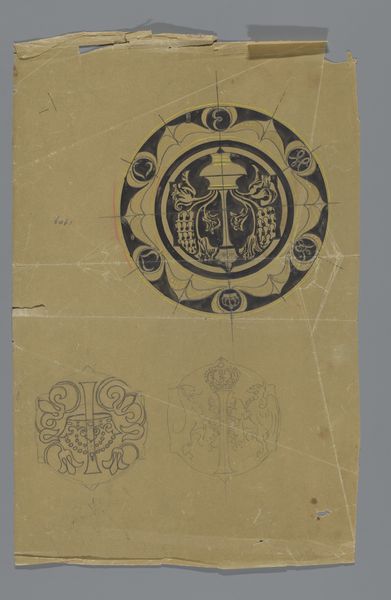
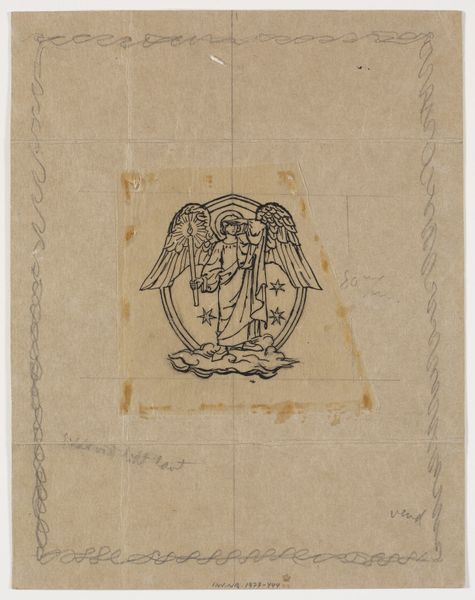
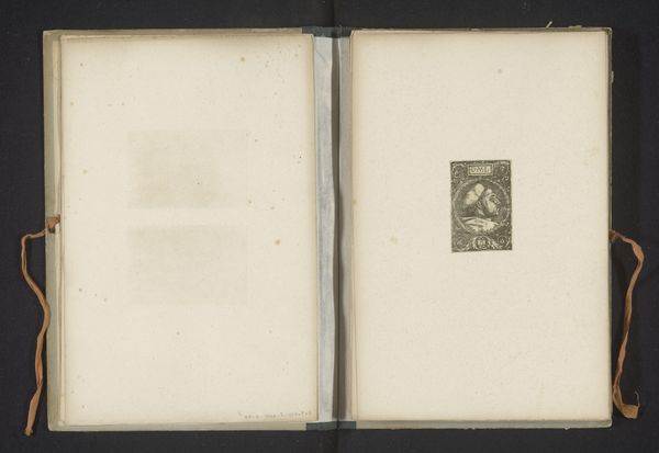
This bookplate from the Van Beresteijn family archive is an ink drawing on paper. Its graphic style gives it a modern feel. The anonymous artist seems less concerned with perfection than with process. You can see it in the slight variations in line thickness and the unevenness of the lettering. The textures are simple but effective: the smooth paper contrasting with the grainy ink. It’s possible the artist used a fine-tipped pen or brush, creating those crisp lines. The design is fairly minimal, a circular emblem with text surrounding a central image of what looks like a bear. What’s great is how the artist uses the marks to create a sense of depth and dimension despite the limited palette. That sketchy bear feels substantial and weighty. It feels like a precursor to some of the graphic design you see in the mid-twentieth century. Like a blueprint of an idea, it shows how the most basic elements can be combined to create something unique and lasting.
Artwork details
- Medium
- graphic-art, print, paper, typography
- Dimensions
- height 22 mm, width 18 mm, height 95 mm, width 55 mm
- Copyright
- Rijks Museum: Open Domain
Tags
Comments
Share your thoughts
About this artwork
This bookplate from the Van Beresteijn family archive is an ink drawing on paper. Its graphic style gives it a modern feel. The anonymous artist seems less concerned with perfection than with process. You can see it in the slight variations in line thickness and the unevenness of the lettering. The textures are simple but effective: the smooth paper contrasting with the grainy ink. It’s possible the artist used a fine-tipped pen or brush, creating those crisp lines. The design is fairly minimal, a circular emblem with text surrounding a central image of what looks like a bear. What’s great is how the artist uses the marks to create a sense of depth and dimension despite the limited palette. That sketchy bear feels substantial and weighty. It feels like a precursor to some of the graphic design you see in the mid-twentieth century. Like a blueprint of an idea, it shows how the most basic elements can be combined to create something unique and lasting.
Comments
Share your thoughts