print, typography, engraving
#
baroque
# print
#
typography
#
history-painting
#
engraving
Dimensions: height 443 mm, width 321 mm
Copyright: Rijks Museum: Open Domain
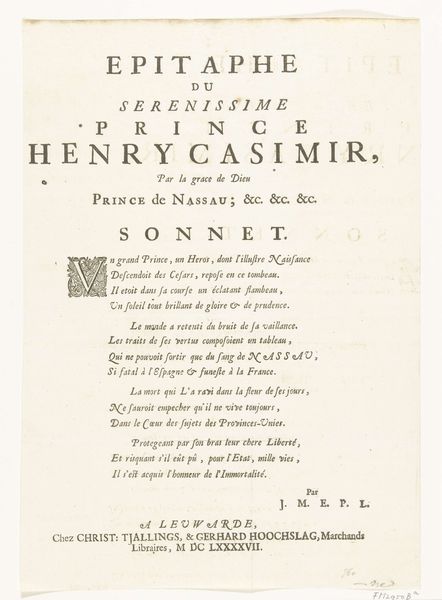
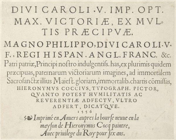
Curator: Here, we have an engraved print, titled "Epitaaf voor Hendrik Casimir II, graaf van Nassau-Dietz, 1697," created in 1697. At first glance, what are your immediate thoughts? Editor: Striking. There is a solemn quality, almost austere, in the careful arrangement of type. I notice how the dark, precise lines of the lettering create a visual rhythm across the page. I also see the scale; the intimate, handheld nature of the piece suggests a personal rather than a monumental expression of grief. Curator: Indeed. Its visual construction, through typography and engraving, elevates it beyond a simple textual announcement. Note the framing and layout, which work to emphasize symmetry and balance—aspects indicative of Baroque sensibilities in memorial art. Editor: Speaking of labor, consider the painstaking craft involved. Each letter, each flourish, is incised by hand. What tools and materials enabled such precision, and what level of skill was required? I also think about how this object would be circulated. Its accessibility points toward a deliberate attempt to disseminate both grief and political messaging, especially since the Nassau-Dietz family were a culturally influential part of the Dutch Stadtholder system. Curator: Excellent points. The text, written in Latin, is carefully divided into sections, further enriching the composition. The initial letters C and D contain spiraling, detailed vegetal ornamentation—echoes of the deceased’s natural origins rendered into idealized abstractions. Editor: So, the physical act of creating and distributing such a piece – the economics and the craft involved – they also play a role in constructing memory, as much as the visual composition. These factors become more transparent the more we examine the conditions of its production. Curator: A fitting tribute for its time. It synthesizes the weight of history and power through calculated design, with Baroque ideals ever present. Editor: And now, seeing the material reality – how it's made, by whom, and why it was so important to communicate— we understand how much these conditions shape the very narratives around that power.
Comments
No comments
Be the first to comment and join the conversation on the ultimate creative platform.
More like this