graphic-art, print, engraving
#
graphic-art
#
script typography
#
hand-lettering
# print
#
hand drawn type
#
hand lettering
#
text
#
11_renaissance
#
hand-written
#
hand-drawn typeface
#
stylized text
#
thick font
#
handwritten font
#
northern-renaissance
#
engraving
#
small lettering
Dimensions: height 205 mm, width 260 mm
Copyright: Rijks Museum: Open Domain
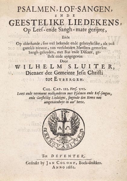
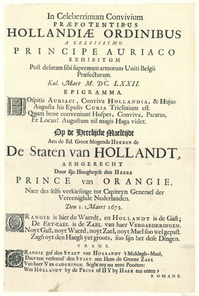
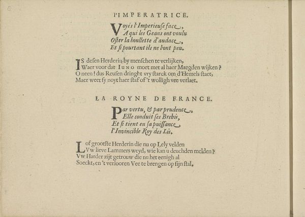
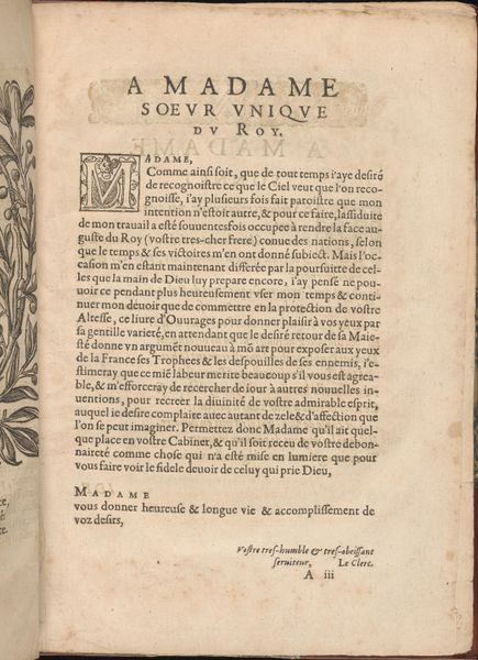
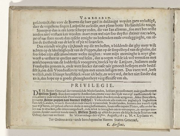
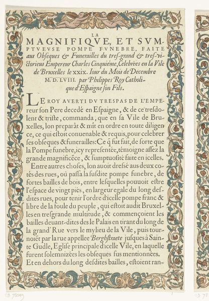
Editor: This is the "Titelprent voor een reeks over de overwinningen van Karel V," or Title Print for a series about the victories of Charles V, created by Hieronymus Cock in 1556. It's a print, predominantly text in Latin and a bit of French at the bottom. The density of the text is quite striking. What story do you think it tells us about its historical moment? Curator: It's a fascinating piece, especially when considered within the socio-political context of its creation. Prints like these played a crucial role in shaping public perception. This isn't just about celebrating Charles V; it’s about constructing and disseminating a very specific image of power. Consider where it was made: Antwerp. A major center for printing and a strategic location for the flow of information across Europe. Editor: So, the location influenced its function? Curator: Absolutely. Antwerp was deeply connected to Charles V’s empire. The “privilege du Roy” mentioned at the bottom, meaning it was printed with royal approval for six years, emphasizes the political agenda behind it. Editor: It almost feels like propaganda. Curator: Precisely. And look at the way Cock, identified as “painter and typographer,” positions himself. It's not merely art; it’s strategic communication. Do you see how this image aims to solidify Charles V’s legacy at a time of potential upheaval, close to his abdication? Editor: That makes perfect sense. It's not just a historical document; it's actively shaping history. Seeing the print in light of that perspective makes it more fascinating. I would never thought about it in terms of it being some sort of publicity.
Comments
No comments
Be the first to comment and join the conversation on the ultimate creative platform.
