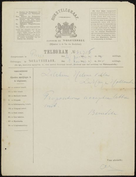
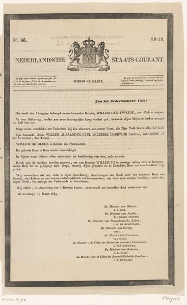
Buitengewone Nederlandsche Staats-Courant. Zondag, 31 December. No. 310*. 1843 Possibly 1843
0:00
0:00
algemeenelandsdrukkerij
Rijksmuseum
print, paper, typography
#
dutch-golden-age
# print
#
paper
#
typography
#
history-painting
Dimensions: height 413 mm, width 255 mm
Copyright: Rijks Museum: Open Domain
Curator: This piece, titled "Buitengewone Nederlandsche Staats-Courant. Zondag, 31 December. No. 310*. 1843," created possibly in 1843 by Algemeene Landsdrukkerij, and held at the Rijksmuseum, seems to be a printed paper announcement. Editor: Exactly! It feels quite austere, almost severe. The stark typography and the central coat of arms create a very formal impression. What jumps out at you about its design? Curator: I’m immediately drawn to the interplay of visual elements within the frame. Consider the hierarchy established through typography; note how the artist has utilized varied fonts to differentiate between the title, date, and the body of the text. What purpose does this design decision achieve? Editor: I suppose it guides the viewer's eye and emphasizes key information. The size and style signal importance, separating the heading from the details about King Willem Frederik's burial. Curator: Precisely. Further analyze the negative space surrounding the text. The calculated use of blank areas gives emphasis and also lends the paper a sense of stately grace, don't you agree? It underscores the official character of the announcement. Editor: Yes, there's a definite balance despite its simplicity. And what do you make of the coat of arms right at the top? Is that just a marker of authenticity? Curator: Certainly, it signifies authority and serves as an emblem of the state. Also look at how it functions aesthetically, breaking up the rigidity of the purely typographic elements and giving the eye something more visually engaging to fix upon. It provides balance within the overall structure. Editor: That makes perfect sense. The visual components all work together to give a specific impression of seriousness. It makes me appreciate how every detail in the layout helps convey meaning. Curator: Indeed. Paying attention to the form allows us to better understand its function.
Comments
No comments
Be the first to comment and join the conversation on the ultimate creative platform.
More like this