print, typography, poster
#
art-nouveau
# print
#
typography
#
poster
Copyright: Rijks Museum: Open Domain
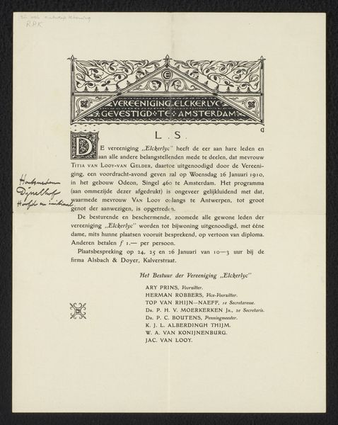
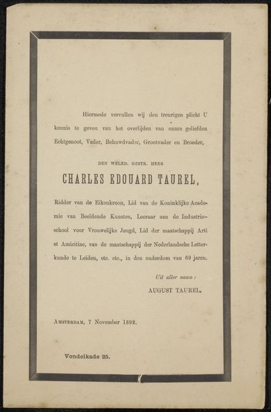
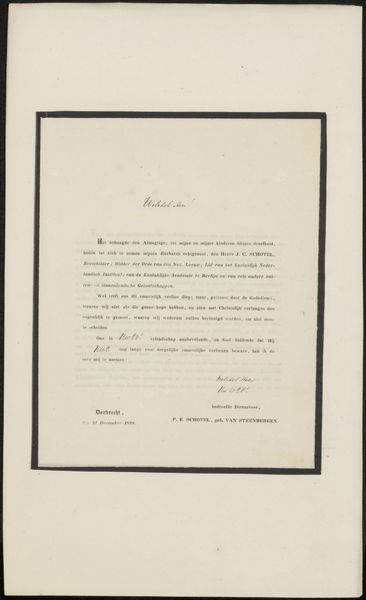
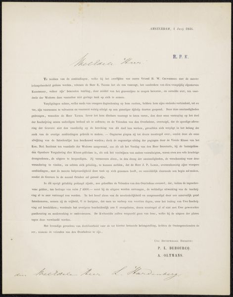
Curator: So, this print, quite possibly from 1903, currently residing in the Rijksmuseum, is called "Invitation to Philip Zilcken." Although the name suggests a private correspondence, it really is an invitation to a series of events to honor Camille Lemonnier, another author of the time. Editor: Well, first thing that strikes me is the formal typography, rather beautiful in its precision, almost architectural in its arrangement on the page. It feels both inviting and authoritative, promising a grand celebration. It makes me consider the labor involved in producing something like this at the turn of the century. Curator: Exactly. It speaks to the broader artistic movement known as Art Nouveau, especially its application to printed media. We tend to focus on painting and sculpture but pieces such as this poster demonstrate Art Nouveau's presence in everyday lives, through font, text, and visual organization.. It gives a sense of who these authors, printers, and publishers actually *were.* What was their daily life? How were they organizing themselves? What was their relationship to production? Editor: It is fascinating to imagine the design process itself; what kinds of papers would be selected for something of this nature, especially given that there are hints of water damage across it. And then, what were the societal relationships involved in commissioning it? "Manifestation en l'honneur de Camille Lemonnier," the inscription notes--but, who exactly was that author? Curator: A very good question! Camille Lemonnier was, indeed, a fairly well-known Belgian writer, influenced by naturalism and known for some controversial subjects. So, the very materiality, or rather the purpose of the material—the poster as printed object—invites viewers to think about not just artistry and craftsmanship, but who the social network consisted of, as it rallied around this important public figure, inviting others into the fold through words and print. It’s not just an invitation; it's a statement. Editor: Thinking about this now, it is far more than a notice about authors; the print becomes the point. What is amazing is its celebration, but, furthermore, its celebration in and of itself became an *artwork* in its own right. We might reflect further on how typography is so important: the texture and impression in its very arrangement... What a delightful thing! Curator: An artwork celebrating the legacy and process, perhaps. It's given me so much to consider regarding authorhood in printed artifacts and art movements, too!
Comments
No comments
Be the first to comment and join the conversation on the ultimate creative platform.
More like this