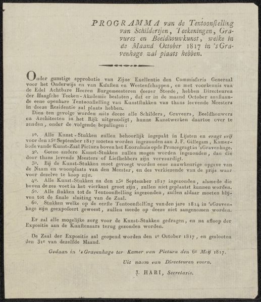
graphic-art, print, typography
#
graphic-art
# print
#
typography
Dimensions: height 198 mm, width 247 mm
Copyright: Rijks Museum: Open Domain
Curator: This vignette by Gerrit Willem Dijsselhof, dating from 1893-1894 and held at the Rijksmuseum, showcases distels in print, graphic art, and typography. It is incredibly understated. Editor: Yes, the print does seem rather minimal and muted in terms of its design and layout. What can we take away from this piece? Curator: Well, considering the context, Dijsselhof was deeply involved in the Arts and Crafts movement. A materialist approach directs us to consider the labor involved. Think of the intricate process of creating this print, the typography, the physical act of carving, setting the type, and printing. What does that labor signify? Editor: It speaks to a dedication to craft, I would think, and a rebellion against mass-produced imagery? Curator: Precisely. The medium here, the print itself, becomes significant. Dijsselhof chose graphic art as a means of production, accessible to a wider audience than, say, an oil painting hanging in a private gallery. It is within a book, amongst information accessible for all. Consider the social context: a move away from elitist art forms and toward democratic access through the means of making itself. How does the subject matter, the distel, factor into this democratisation of making? Editor: Good point. It is native, quite ordinary perhaps. Not necessarily precious. It’s definitely got me thinking about the choices the artist makes beyond just aesthetics. Curator: Exactly, understanding those choices opens up a world beyond pure representation, revealing layers of intention related to production and access. It is a work not only for art’s sake but one conscious of its very manufacture.
Comments
No comments
Be the first to comment and join the conversation on the ultimate creative platform.
More like this