print, typography
#
portrait
#
neoclassicism
# print
#
typography
#
script
#
stylized text
#
classical type
#
calligraphy
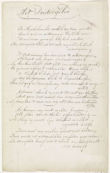
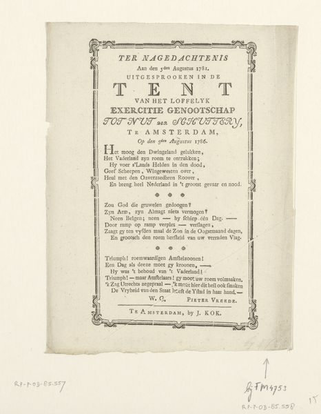
Dimensions: height 234 mm, width 183 mm
Copyright: Rijks Museum: Open Domain
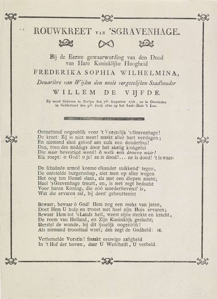
This is Johannes Mattheus Sobels' "Grafschrift voor prins Frederik", made in 1799. The artwork is dominated by its textual content. Sobels uses typography and layout to create a visually structured composition. The careful arrangement of words, phrases, and symbols on the page invites us to read the artwork not just for its literal message but for its visual form. The skull-and-crossbones motifs punctuate the text, serving as visual markers that frame the theme of mortality. These images are a semiotic code, simultaneously reminding us of death and of the historical context in which the text was produced. The poem itself praises Prince Frederik, imbuing the text with an emotional valence. The work destabilizes conventional boundaries between literature and visual art, challenging us to consider how text can function aesthetically. It's a reminder that meaning is created through both the literal and the visual. The typeface is austere, yet it functions as a commentary on representation, memory, and the cultural values placed on historical figures.
Comments
No comments
Be the first to comment and join the conversation on the ultimate creative platform.
More like this