graphic-art, print, typography
#
graphic-art
# print
#
typography
#
history-painting
Dimensions: height 313 mm, width 267 mm
Copyright: Rijks Museum: Open Domain
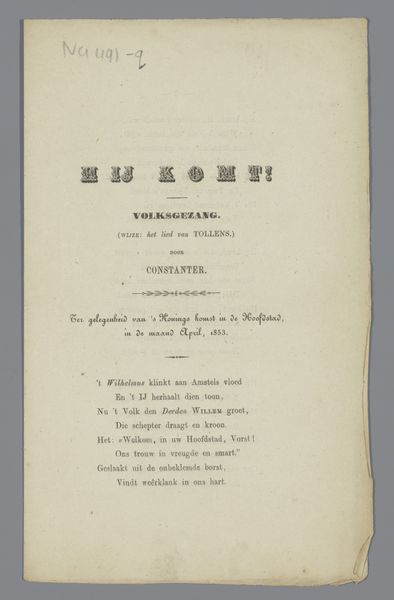
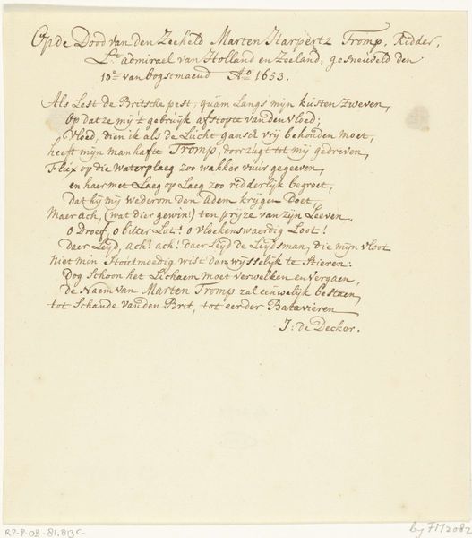
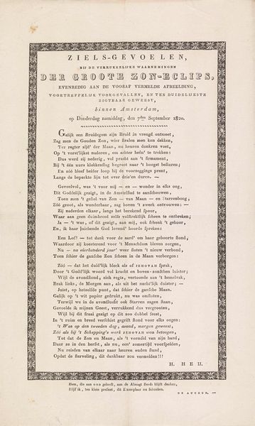
Curator: Here we have a rather intriguing piece titled "Lied ter eere van luitenant Koopman," a print that likely dates between 1833 and 1838, paying tribute to a Dutch naval hero. What is your first reaction? Editor: Austere, yet proud. The typography has a formal elegance, but there's a ghostly quality about it too, as if it's an echo from the past, not fully present. There's something fragile in that aging paper as well. Curator: The fragility you perceive resonates with the sociopolitical context of the 1830s in the Netherlands. It came shortly after Belgium seceded and the Netherlands faced significant internal strife and economic depression, resulting in social fragmentation. These commemorative prints valorizing national figures became incredibly important in building shared identity, reinforcing cultural ideologies, and promoting unity. Editor: Absolutely. Koopman's name, the Dutch flag—these are more than just identifiers. They carry weight as symbols of cultural identity and historical narrative, almost talismanic. You see it time and again, in times of turbulence people look towards a mythic history to create some kind of stability in a sea of unknowns. I'm seeing visual echoes of that in this print. The poem, though faded, clearly positions Koopman within this kind of narrative of Dutch heroism and virtue. Curator: The poem highlights the role of the "dappere Held" in embodying and safeguarding the values of the nation, which makes its accessibility important. The decision to produce a print indicates a desire for wider distribution compared to, say, a painted portrait that might adorn the home of a wealthy patron. This piece had the potential to reach a broader audience and, with the inclusion of the tune for singing, engage the population in the experience of national pride and unity. Editor: It’s fascinating to see how symbols adapt and remain over time. The Dutch flag is the main symbol here, as are key features of its construction, such as ships. You could argue those ships later mutated into something like the branding of the Dutch East India Company. I also love that the text, while old, gives the song melody. People probably performed it—making Koopman less a memory and more an event that they remember. Curator: Absolutely. By exploring how artworks such as "Lied ter eere van luitenant Koopman" are entrenched in historical currents and engage in social mobilization, we unveil their profound relevance to our times. Editor: A simple song sheet can really echo with the dreams and tensions of an era, and point towards others that continue resonating across the ages.
Comments
No comments
Be the first to comment and join the conversation on the ultimate creative platform.
More like this