print, textile, paper, typography, engraving
#
dutch-golden-age
#
ink paper printed
#
parchment
# print
#
old engraving style
#
hand drawn type
#
textile
#
paper
#
typography
#
engraving
#
calligraphy
Dimensions: height 210 mm, width 158 mm
Copyright: Rijks Museum: Open Domain
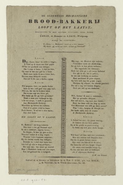
Pieter Vreede created this print in 1786 in Amsterdam. Its dominant feature is the central block of text, framed by an ornamental border. The typography itself—the layout, choice of fonts, and the hierarchical arrangement of the words—creates a visual structure, almost like a building. The poem commemorates the naval battle at Dogger Bank. But look at the words themselves. Notice how the visual rhythm created by the font sizes and spacing mirrors the cadence of the verses. The poem's structure is one of opposition. The first half laments the state of the Netherlands. The second half offers a message of hope and triumph through freedom and statehood. Consider the semiotic implications of the lettering. Each letter is a sign, and when combined, these signs communicate complex cultural and political meanings. The formal arrangement of the text, therefore, becomes a visual metaphor for the balance and order the poem advocates for Dutch society. It's not just about what the poem says, but how its visual structure conveys a message of resilience and hope.
Comments
No comments
Be the first to comment and join the conversation on the ultimate creative platform.
More like this