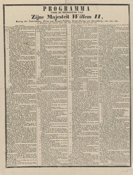
1634
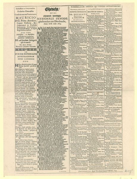
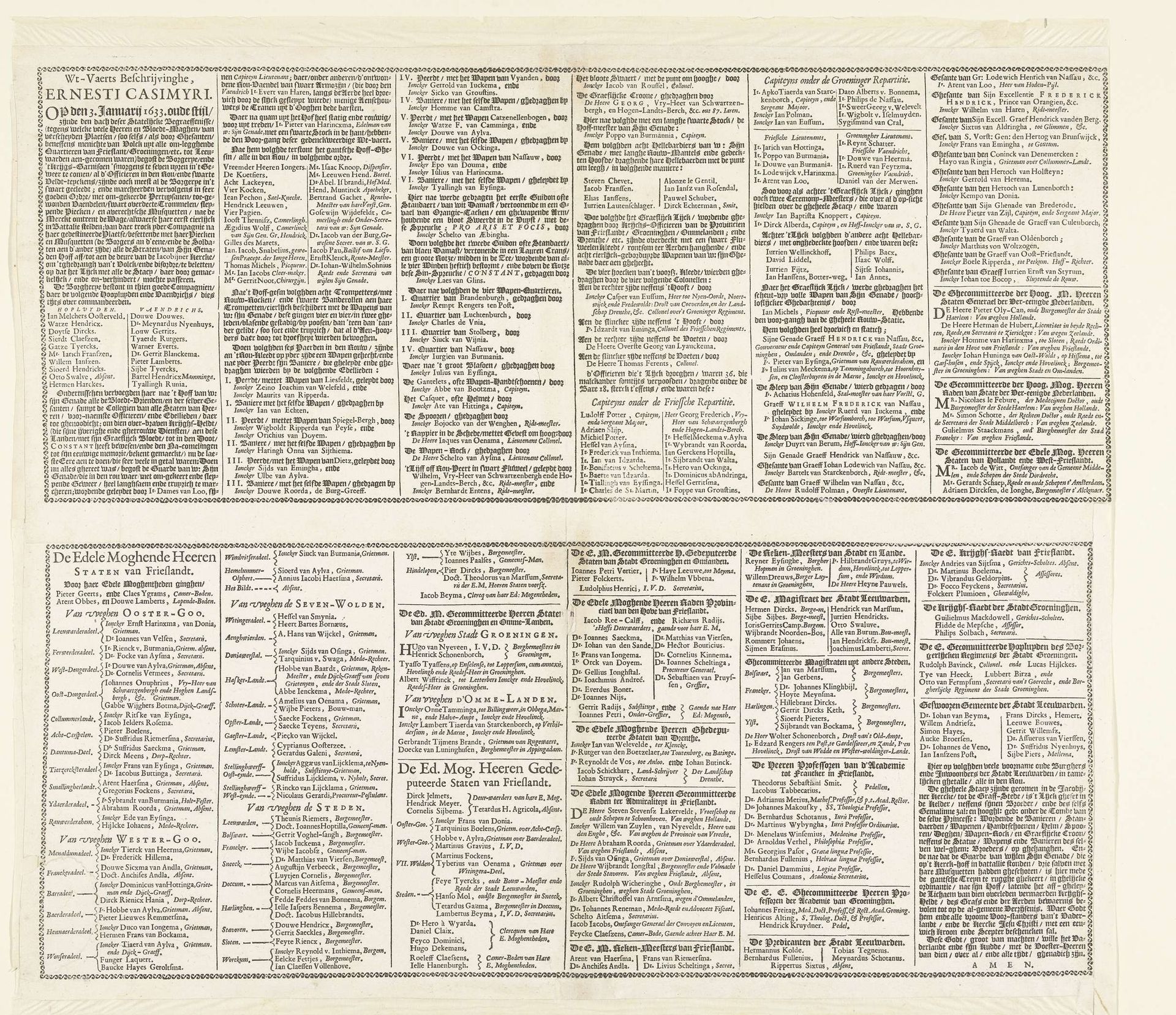
Tekstblad met titel en gedicht voor de prentserie van de begrafenis van Ernst Casimir, graaf van Nassau-Dietz te Leeuwarden, 1633
Listen to curator's interpretation
Curatorial notes
Editor: This is a printed text page from 1634, created to accompany a print series about the funeral of Ernst Casimir. Looking at the tight arrangement of text blocks and varied fonts, I’m struck by its overall density and the attention given to layout. What do you notice about this piece? Curator: From a formalist perspective, observe how the typographical arrangement operates as the primary structuring element. Consider the deliberate use of varied fonts—their sizes, weights, and orientations create a visual hierarchy. How might the density and framing of these individual textual units affect the legibility of the text? Editor: It almost seems less about legibility and more about visual impact, like a structured, textual tapestry. Curator: Precisely. Reflect upon the interplay of positive and negative space, of darkness and light, shaped by these densely packed characters. How do you interpret this treatment? Could it signify importance? Consider the balance created. The relationships formed are not necessarily designed for reading but to deliver a certain effect. Editor: So, it’s less about conveying literal information and more about creating a feeling, an aesthetic experience? Curator: In essence, yes. Consider the surface quality, the materiality of the print itself—the ink pressed upon the paper. The layout itself conveys just as much if not more information than the actual words written within each field of text. How can that surface design be analyzed for its emotive value? Editor: That makes me consider how a modern magazine would approach a memorial today and all the changes in typographical forms. Curator: Indeed. This piece offers a fertile ground for such comparisons through its emphasis on formal elements above direct narrative communication.