graphic-art, print, paper, typography, engraving
#
script typeface
#
graphic-art
#
magazine cover layout
#
page thumbnail
#
baroque
#
dutch-golden-age
# print
#
paper
#
typography
#
spread layout sheet
#
newspaper layout
#
image and text
#
handwritten font
#
captioned image
#
page layout
#
word imagery
#
engraving
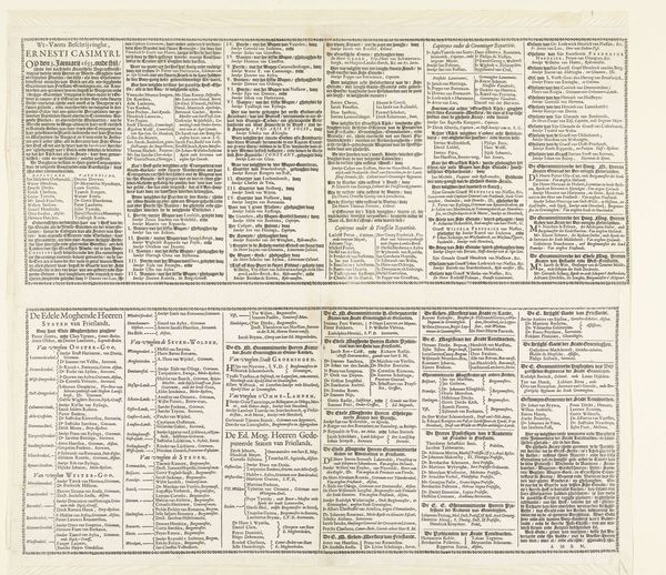
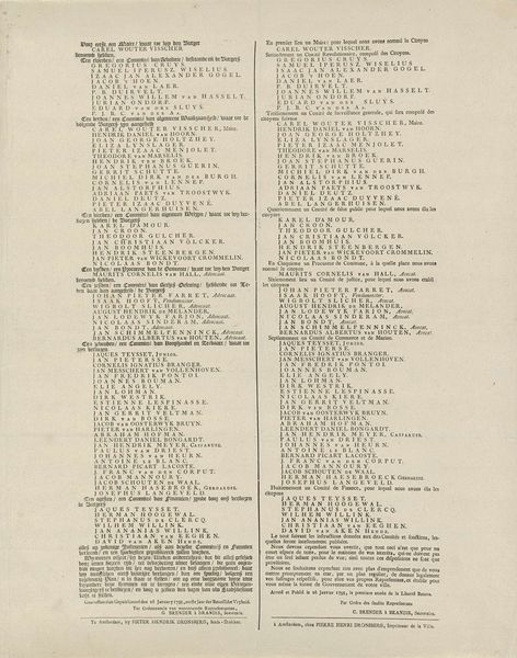
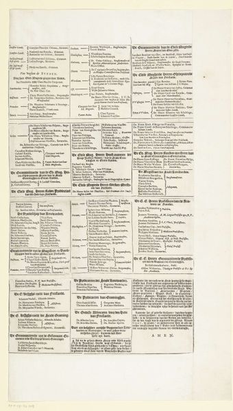
Dimensions: height 503 mm, width 380 mm
Copyright: Rijks Museum: Open Domain
Curator: Here we have "Tekstblad bij de prent 'Synodi Dordracenae delineatio'," a printed sheet from 1639 by Claes Jansz. Visscher, housed at the Rijksmuseum. It’s dense, typographic, very of its time. What leaps out at you? Editor: My initial thought is overwhelming! It feels like a historical document, dense with text, names, and a visual weight that almost feels like a statement in itself. It's like peering into a 17th-century newsletter, serious and self-important, I think. Curator: That gravity you're sensing—it absolutely reflects the historical weight of the Synod of Dordrecht, a major event in Dutch Reformed theology. Visscher presents it almost as a...legal document but with, a performative flair, you might say. Editor: Exactly. Considering that this Synod was a response to theological divides and had immense political implications, Visscher's approach positions it firmly within the era's power dynamics, no? Who were the intended audiences? Curator: Ah, a pertinent question! Given the subject matter—theology, politics—the text primarily would have appealed to educated, affluent society, and to people vested in Dutch political and religious life, of course. This was more than just a news sheet, really. Visscher distilled theological debates to an easy-to-access public digest... depending, of course, on how fluent you are in 17th century Dutch! Editor: The sheer volume of text suggests that control of information, even then, was crucial. And I can’t help but notice the emphasis on names and official titles—almost as though asserting the legitimacy and the seriousness of those involved in the Synod. What is most striking is how now the Synod is primarily interesting only to those in niche academics of religious study. Curator: Agreed, the typography creates an aesthetic that simultaneously legitimizes the text and makes it seem even more important than it might have been. This wasn't created as a purely historical record as such: it was part of contemporary culture. Now, of course, we perceive it quite differently. What's really interesting, for me, is that he's presenting this highly ephemeral historical document almost as if it were an artistic artifact in its own right. Editor: I like your thoughts on performative-ness of an archival image! As we reconsider such artwork, let's try to interrogate historical grand narratives that may reinforce the very powers these images once tried to create. What a way to reflect on then and now!
Comments
No comments
Be the first to comment and join the conversation on the ultimate creative platform.
More like this