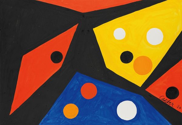
pop art-esque
photo of handprinted image
circular oval feature
childish illustration
stencil
pop art
bright colours popping
bubble style
artificial colours
cartoon style
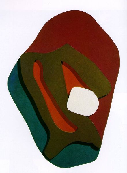
Copyright: Howard Hodgkin,Fair Use
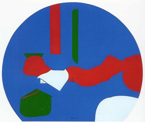
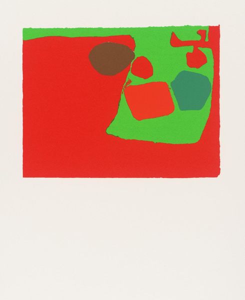
Howard Hodgkin made this print, titled 'Bedroom,' with lithography, a process of layering colours like memories. Hodgkin’s abstract language feels so personal, right? I think that has something to do with the way he lets colour relationships take centre stage. Take that apple green shape, for instance. The way he’s defined the border with a hard black line, that's very deliberate. But then notice the brown area above, which seems to bleed into the green. He's letting these hues collide, creating friction and harmony at the same time. I'm reminded of Patrick Heron, another British painter interested in the emotional capacity of colour relationships. Like Heron, Hodgkin creates work which shows us that painting is about feeling and thinking, but it is equally about the joy of seeing. Art like this proves that ambiguity is a strength, not a weakness.
Comments
No comments
Be the first to comment and join the conversation on the ultimate creative platform.