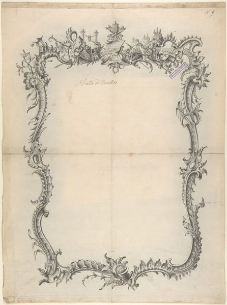
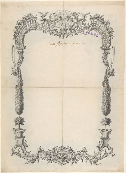
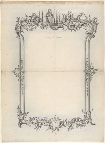
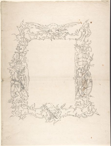
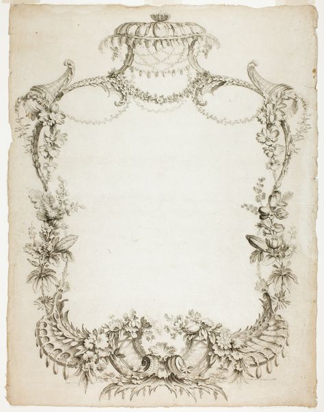
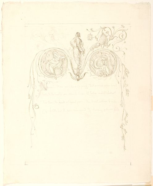
Design for a frame with Eagles and Trophies 1750 - 1788
0:00
0:00
drawing, print
#
drawing
#
toned paper
#
light pencil work
# print
#
ink drawing experimentation
#
pen-ink sketch
#
pen work
#
sketchbook drawing
#
watercolour bleed
#
watercolour illustration
#
sketchbook art
#
watercolor
Dimensions: 18 9/16 x 13 7/16 in. (47.1 x 34.1 cm)
Copyright: Public Domain
Curator: What strikes me immediately is the stark elegance. It's quite beautiful, almost like a whispered promise of grandeur. Editor: Indeed. What we're looking at is a design for a frame, created by Johann Oktavian Salver, likely sometime between 1750 and 1788. It's a pen and watercolor drawing on toned paper currently residing here at The Metropolitan Museum of Art. Curator: Toned paper provides such depth; the shadows become immediate, almost assertive. And those eagles, the weaponry... they certainly telegraph power, don't they? There is definitely a martial language at play. Editor: Absolutely. This aesthetic was highly influenced by the prevailing political climates in Europe. Aristocratic displays of power and prestige were common, reflecting ambition but also internal power struggles within monarchies. We see the use of classical motifs in trophy arrangements with the weapons too. Curator: Look how skillfully Salver deployed classical imagery to underscore legitimacy. Eagles were potent symbols of Roman imperial power. Those specific icons would immediately evoke notions of continuity, of an empire meant to last. Did that symbolic weight have much sway? Editor: Symbols are rarely innocent; they are political messaging. It reinforced the image that certain families projected of themselves—divinely ordained rulers, inheritors of greatness, all meant to elicit reverence, perhaps even fear. It shaped court life! Curator: Even the wreath that cradles one eagle almost seems a visual hug of authority. It's incredible that simple ink strokes can create such potent symbols, embedding them within the culture for centuries after. Editor: The beauty here is that a pen, ink, and wash design had cultural work to perform. The goal, for better or worse, was to translate power visually, and influence how it was both perceived and perpetuated. Curator: So, while seemingly a simple frame design, it carries echoes of historical machinations, revealing an era keen to control and perpetuate particular visual languages of might and dominance. It’s chilling, somehow. Editor: I think chilling is precisely the word, underscoring how art is rarely separate from the socio-political tapestry it emerges from. Thank you for taking us to those depths.
Comments
No comments
Be the first to comment and join the conversation on the ultimate creative platform.
More like this