drawing, paper, ink
#
drawing
#
homemade paper
#
script typography
#
light coloured
#
hand drawn type
#
personal journal design
#
paper
#
abstract
#
personal sketchbook
#
ink
#
hand-drawn typeface
#
fading type
#
stylized text
#
thick font
#
modernism
#
calligraphy
#
monochrome
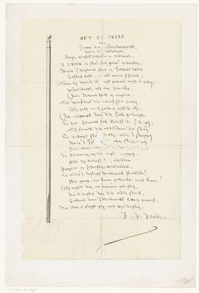
Dimensions: height 337 mm, width 630 mm
Copyright: Rijks Museum: Open Domain
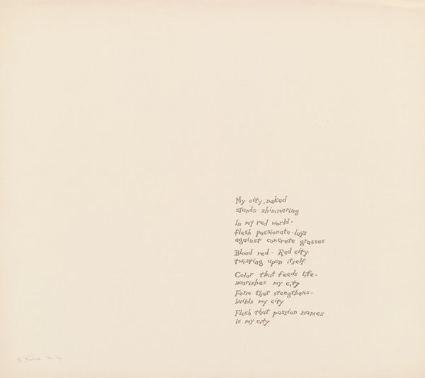
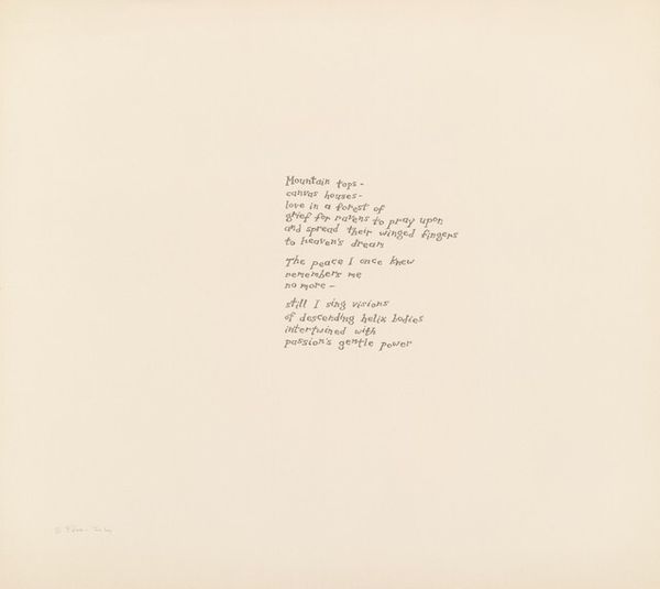
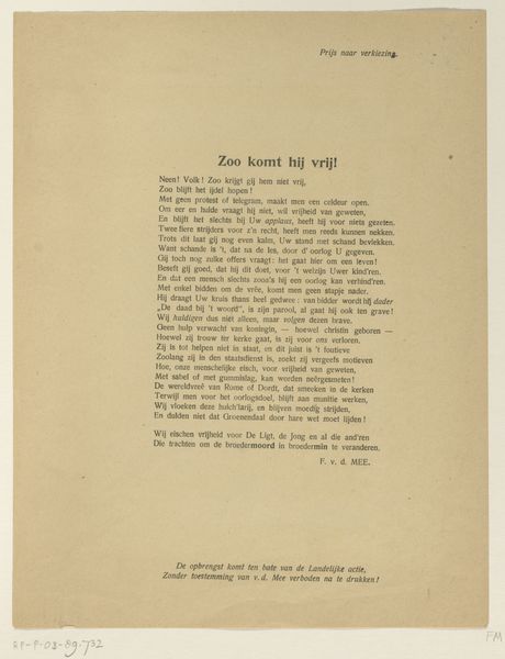
Curator: This work, known as "Wittevrouwenpoort" by Dirkje Kuik, predates 1982 and combines ink and drawing on paper. I am immediately drawn to its unusual textual presentation. It's more than just calligraphy; it verges on abstraction. What structural elements strike you? Editor: It seems almost like a page from a personal journal, a sort of stream-of-consciousness laid out on paper. The faded ink and the varying thickness of the font create an intimate, almost vulnerable, feeling. What's your interpretation of the text as a compositional element? Curator: The text, which appears to be hand-drawn typography, is crucial. The varying weights and faded quality create a dynamic surface, an interplay of light and shadow. Consider how the artist manipulates line and form within each letter, almost treating them as miniature abstract compositions. The negative space around the text is equally important. Does this interplay create tension or harmony? Editor: I see tension in the density of the script compared to the openness of the surrounding paper. It feels like the text is pushing against its boundaries. It looks experimental. Curator: Precisely. Note also the quality of the paper itself. The slight imperfections and handmade quality add another layer of meaning. It removes any sense of mechanical reproduction and reinforces the artist’s hand and individual expression. Editor: That’s a good point. I was so focused on the writing that I overlooked the material itself. Looking at the paper, I feel a raw and personal touch, just like you mentioned, adding meaning to the work. Curator: And hopefully that personal touch gives you more food for thought about formalism, now and moving forward!
Comments
No comments
Be the first to comment and join the conversation on the ultimate creative platform.
More like this