drawing, paper, ink, architecture
#
architectural sketch
#
drawing
#
baroque
#
architectural plan
#
landscape
#
paper
#
ink
#
architectural drawing
#
architecture drawing
#
architecture
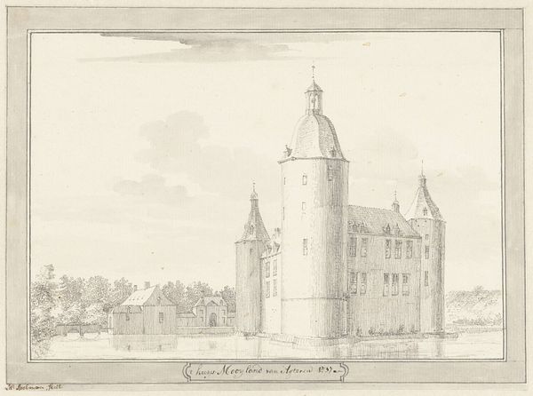
Dimensions: height 110 mm, width 178 mm
Copyright: Rijks Museum: Open Domain
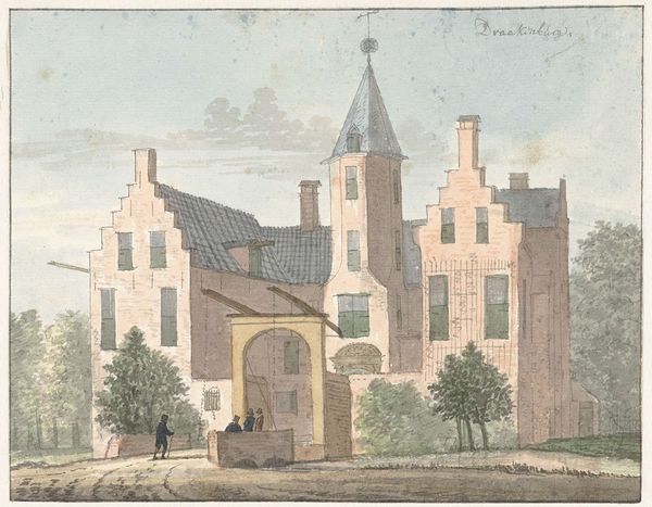
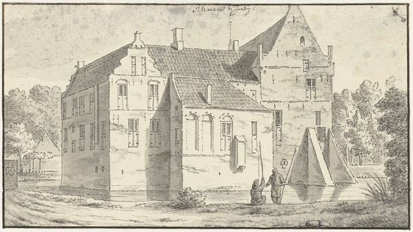
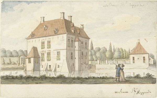
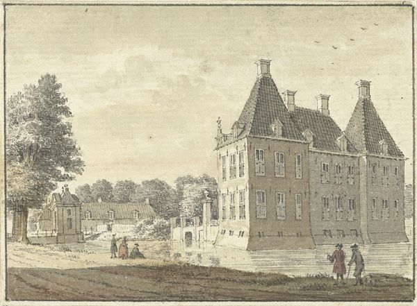
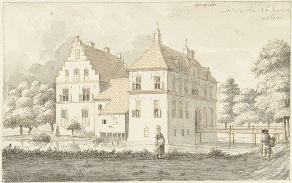
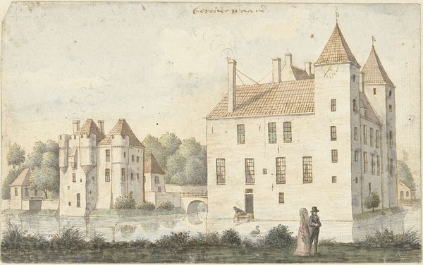
Curator: Let's discuss this 1732 drawing, “Gezicht op de havezate Rhaan bij Hellendoorn, van voren” or "View of Rhaan Manor near Hellendoorn, from the front," by Cornelis Pronk, held at the Rijksmuseum. It’s an ink drawing on paper showcasing a Dutch manor house. Editor: My immediate impression is one of tranquility. There's a quiet formality to it. The muted tones and careful lines create a sense of dignified stillness. Curator: Precisely. Pronk’s technical skill is evident in the precision of the architectural details. Note the linear perspective and the use of light and shadow to define the building's form. The composition, a study in balanced asymmetry, draws the eye across the facade. Editor: I am struck by the symbolism of the architecture itself. Manors of this period represented not only wealth but also societal stability and power. The balanced, symmetrical features that you have noted would signify order and reason – powerful concepts in that era. The careful lines suggest meticulous governance and control over the landscape. Curator: A very astute point. The manor isn't merely a building; it's a visual representation of social order. However, from a formal perspective, Pronk manipulates the interplay of verticals and horizontals. He masterfully deploys variations in line weight to give the drawing depth and legibility, thus highlighting the pure structure and design. Editor: Absolutely. And the very act of creating such a precise representation – almost an idealized version of the building – suggests a desire to preserve and memorialize the manor, not just as a physical structure, but as a symbol of cultural continuity and status. Think of it as a carefully curated piece of propaganda through architecture. Curator: Intriguing analysis. Pronk, in choosing this subject, provides a commentary through the visual medium of this structured, formal setting. Editor: By exploring the symbolism and the underlying messages of power and cultural continuity that works like this carry, we can engage deeply with the past. Thanks to the formal expertise that defines Pronk’s artistic style, we also know exactly how effective his chosen medium would have been at the time.
Comments
No comments
Be the first to comment and join the conversation on the ultimate creative platform.
More like this