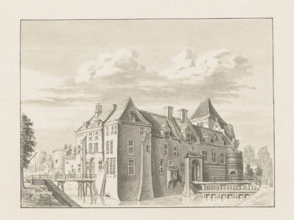
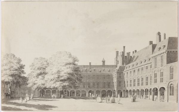
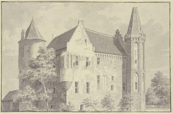
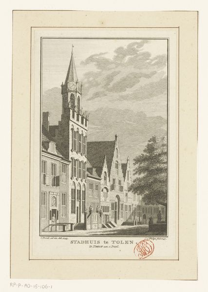
drawing
#
drawing
#
baroque
#
dutch-golden-age
#
cityscape
#
street
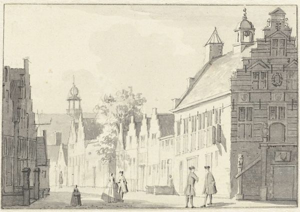
Dimensions: height 192 mm, width 238 mm
Copyright: Rijks Museum: Open Domain
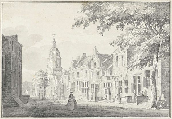
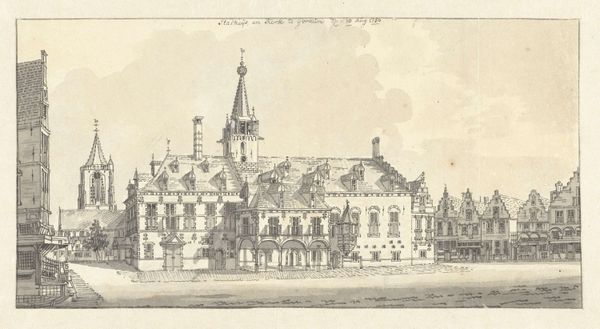
Cornelis Pronk made this drawing of the Grote Kerkhof in Deventer with pen in gray ink, and brush in gray wash. Gray ink is an interesting choice for depicting architecture; it subtly enhances the textures of the brickwork and stone, bringing out details like the window frames and the tower on the right. It also emphasizes the play of light and shadow across the facades, with the gray wash adding depth and volume. The use of ink and wash allowed Pronk to create fine lines and subtle gradations of tone, essential for accurately rendering the architectural details. Pronk was known for his topographical drawings, and this one is no exception. It’s a precise record, yet softened through the skillful application of the gray wash. Pronk’s methods are more aligned to the applied arts than fine art, serving a documentary function. His work gives us insight into the built environment and social life of the time. It reminds us that even seemingly straightforward images can carry layers of meaning and intention.
Comments
No comments
Be the first to comment and join the conversation on the ultimate creative platform.
More like this