About this artwork
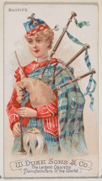
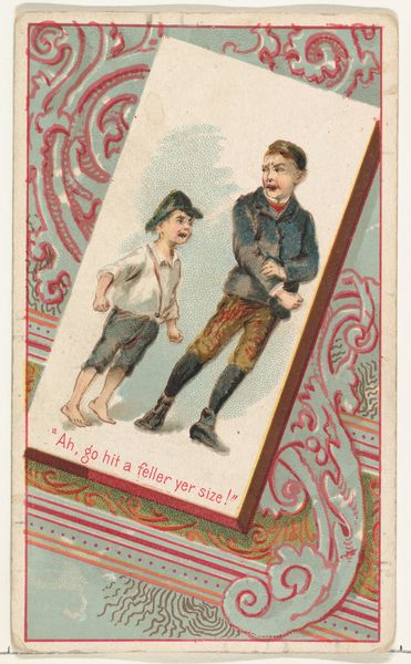
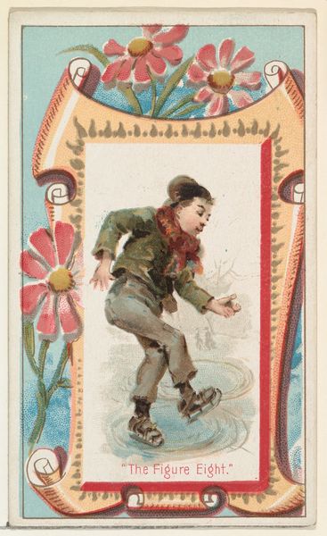
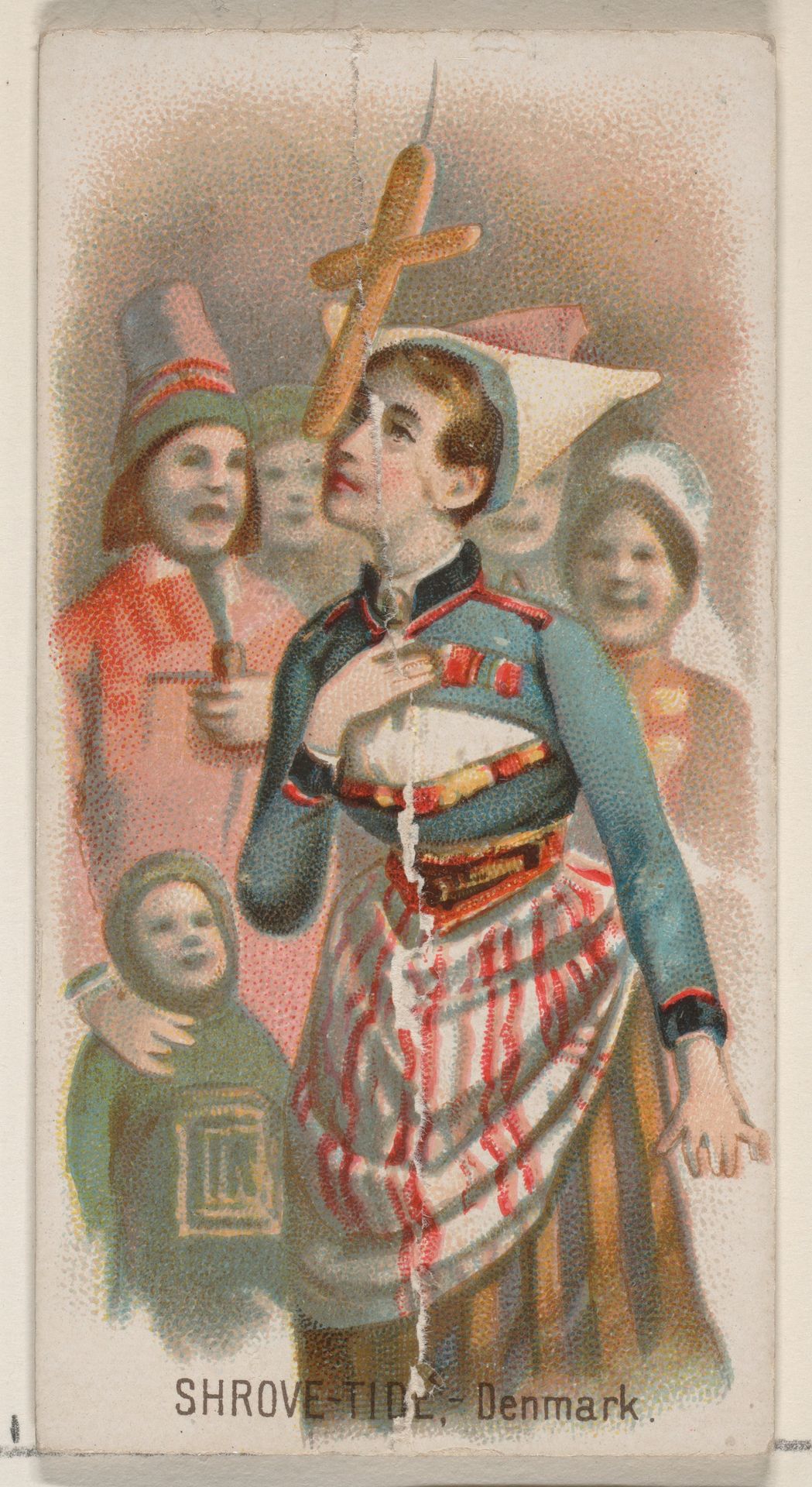
Editor: This is "Shrove-Tide, Denmark," a colored-pencil print from around 1890, part of the Holidays series by W. Duke, Sons & Co. The texture feels almost like watercolor. It's a quirky, intriguing image; the central figure’s direct gaze and somewhat distressed expression are very arresting. What stands out to you from a formalist perspective? Curator: Observe how the artist employs a restricted color palette. The muted blues and reds create visual harmony and unity. Notice how the gaze is upward; the object is directly above the center which places the audience perspective at ground-level. How does this asymmetry alter your sense of spatial relationships within the image? Editor: It definitely makes me look up, feel small. The figures around the main subject almost become a backdrop, even though they’re actively engaged, aren't they? How does the materiality influence our reading of the artwork's overall effect? Curator: The choice of colored pencil as a medium is crucial. It produces a unique softness, with less contrast. The artist's handling of the material contributes significantly to the artwork’s distinctive charm. Its lightness, in contrast to oil paint, generates a sense of playful spontaneity. Editor: So it is more about what is in the piece, than where it came from? It gives a unique point of view. Curator: Precisely. We derive meaning from form, not necessarily from extraneous historical factors. The elements are working together to achieve something unique that evokes feelings that might have otherwise been overlooked. Editor: I see. The visual language becomes the story itself. Thanks! Curator: My pleasure! Understanding the form enables understanding the intention of the message that transcends time and place.
Shrove-Tide, Denmark, from the Holidays series (N80) for Duke brand cigarettes
1890
W. Duke, Sons & Co.
1870 - 1920The Metropolitan Museum of Art
Metropolitan Museum of Art, New York, NYArtwork details
- Medium
- drawing, coloured-pencil, print
- Dimensions
- Sheet: 2 3/4 x 1 1/2 in. (7 x 3.8 cm)
- Location
- Metropolitan Museum of Art, New York, NY
- Copyright
- Public Domain
Tags
portrait
drawing
coloured-pencil
impressionism
coloured pencil
watercolour illustration
genre-painting
portrait art
watercolor
Comments
Be the first to share your thoughts about this work.
About this artwork
Editor: This is "Shrove-Tide, Denmark," a colored-pencil print from around 1890, part of the Holidays series by W. Duke, Sons & Co. The texture feels almost like watercolor. It's a quirky, intriguing image; the central figure’s direct gaze and somewhat distressed expression are very arresting. What stands out to you from a formalist perspective? Curator: Observe how the artist employs a restricted color palette. The muted blues and reds create visual harmony and unity. Notice how the gaze is upward; the object is directly above the center which places the audience perspective at ground-level. How does this asymmetry alter your sense of spatial relationships within the image? Editor: It definitely makes me look up, feel small. The figures around the main subject almost become a backdrop, even though they’re actively engaged, aren't they? How does the materiality influence our reading of the artwork's overall effect? Curator: The choice of colored pencil as a medium is crucial. It produces a unique softness, with less contrast. The artist's handling of the material contributes significantly to the artwork’s distinctive charm. Its lightness, in contrast to oil paint, generates a sense of playful spontaneity. Editor: So it is more about what is in the piece, than where it came from? It gives a unique point of view. Curator: Precisely. We derive meaning from form, not necessarily from extraneous historical factors. The elements are working together to achieve something unique that evokes feelings that might have otherwise been overlooked. Editor: I see. The visual language becomes the story itself. Thanks! Curator: My pleasure! Understanding the form enables understanding the intention of the message that transcends time and place.
Comments
Be the first to share your thoughts about this work.