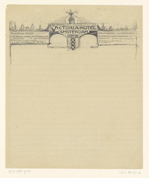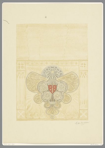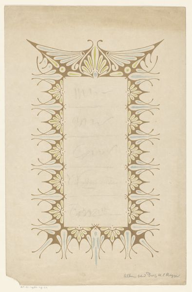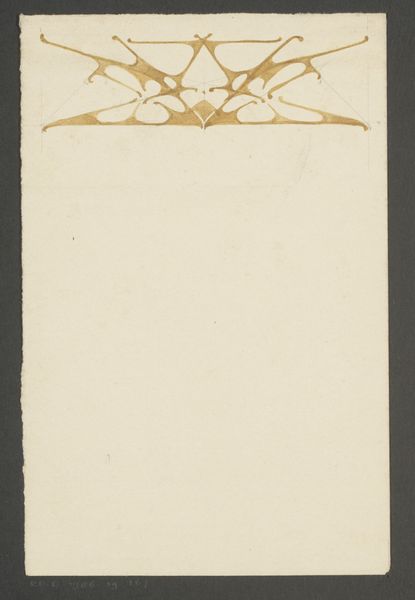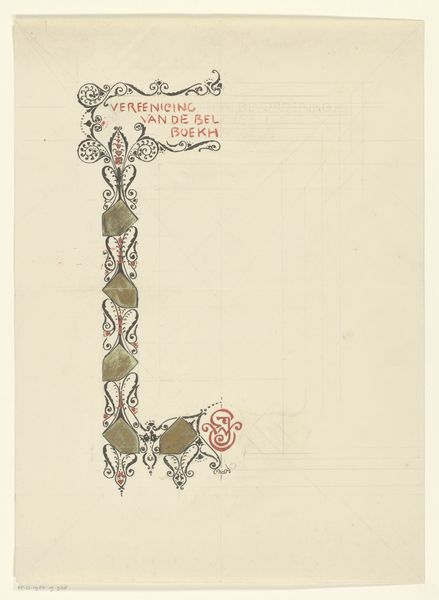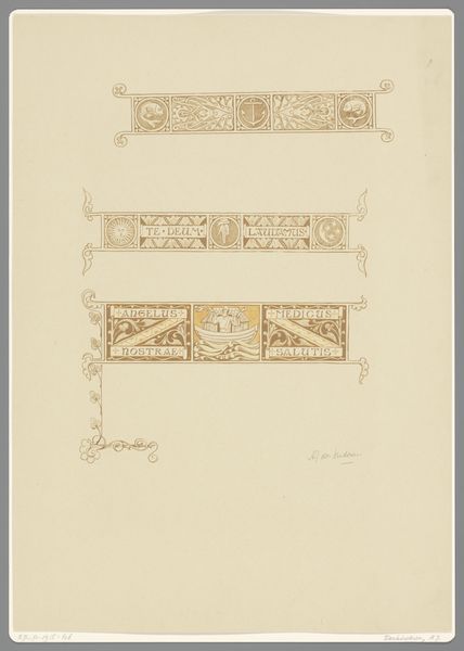
Ontwerp voor een briefhoofd voor het Victoria Hotel in Amsterdam 1935
0:00
0:00
drawing, graphic-art, paper, typography, ink
#
portrait
#
art-deco
#
drawing
#
graphic-art
#
paper
#
typography
#
ink
#
cityscape
Dimensions: height 253 mm, width 210 mm
Copyright: Rijks Museum: Open Domain
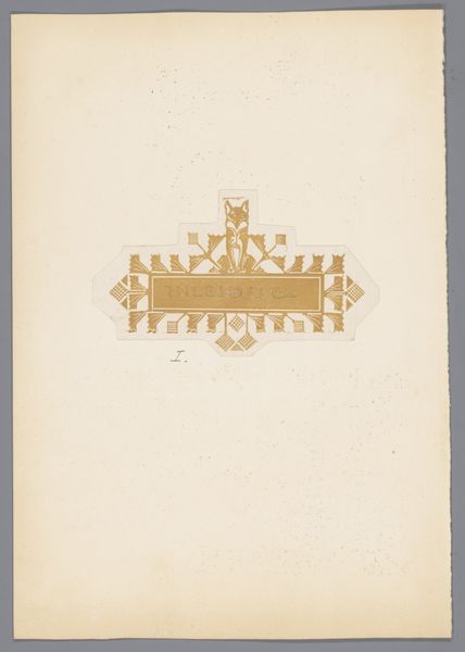
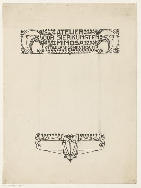
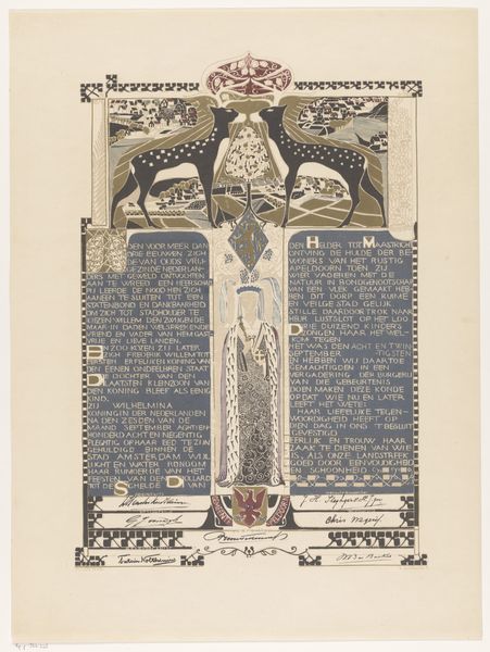
Reinier Willem Petrus de Vries designed this letterhead for the Victoria Hotel in Amsterdam, probably using watercolor or gouache. I love how de Vries lays out the design like a landscape, complete with the Amsterdam skyline! The restrained palette creates an atmosphere that is both elegant and inviting. The lines are so crisp and sure, like a well-designed typeface. It's a testament to the power of simplicity, a skill I admire in any artist. I'm also drawn to the way the artist balances text and image. The typography becomes an integral part of the composition, not just an afterthought. He renders the lettering in warm gold tones. This elevates the letterhead beyond mere functionality, turning it into a miniature work of art. You could compare this piece to the kind of playful graphic design work being produced by artists like El Lissitzky at this time. De Vries embraces ambiguity and multiple interpretations.
Comments
No comments
Be the first to comment and join the conversation on the ultimate creative platform.
