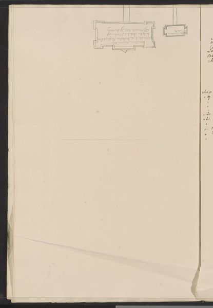
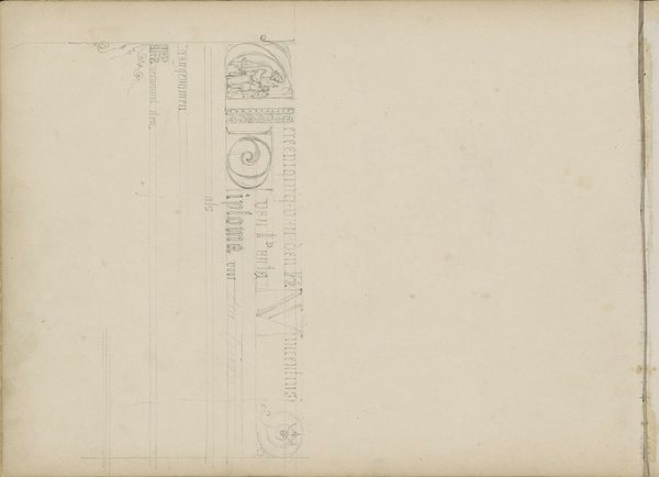
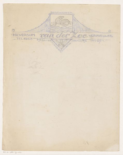
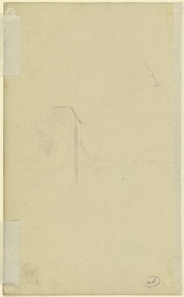
Ontwerp voor een briefhoofd van Motshagens handel in apotheek- en drogisterijbenodigdheden 1884 - 1952
0:00
0:00
drawing, graphic-art, paper, typography, ink, pencil
#
drawing
#
graphic-art
#
aged paper
#
toned paper
#
ink paper printed
#
old engraving style
#
hand drawn type
#
landscape
#
paper
#
typography
#
ink
#
intimism
#
fading type
#
pencil
#
cityscape
Dimensions: height 281 mm, width 210 mm
Copyright: Rijks Museum: Open Domain
Editor: Here we have "Ontwerp voor een briefhoofd van Motshagens handel in apotheek- en drogisterijbenodigdheden," a design for a letterhead by Reinier Willem Petrus de Vries, made sometime between 1884 and 1952 using ink, pencil and typography on paper. It's really neat how the building seems to grow out of the lettering. What do you see in it? Curator: Oh, I'm immediately drawn to its imperfections! The sketchiness…it feels so intimate, like stumbling upon the artist’s personal notepad. Look closely, can’t you almost feel the scratch of the pencil, the tentative strokes exploring the possibility of what a brand can represent? This isn’t just about selling stuff, it’s about imbuing a business with a sense of place and personality. Almost feels like something from a beloved children’s story, doesn’t it? Editor: Definitely! I love that "fading type" style too, how does that aesthetic influence your reading of the piece? Curator: Ah, "fading type" – perfect way to put it! For me, it whispers of time, tradition and a certain quiet dignity. Before the age of bold, brash advertising, this was how a business made its mark. Less about shouting, more about a gentle reminder: "We’re here, we're established, and we care about the details." What stories might this letterhead have told? What hopes and aspirations did it carry? I almost feel like I can smell the apothecary’s herbs. Editor: It really brings it to life thinking that way! I had just been seeing an old design, but it's clearly more than that. Thanks! Curator: My pleasure. Never forget the stories behind the image. They are there, trust me, and once found, they breathe vibrant life into even the most faded ink.
Comments
No comments
Be the first to comment and join the conversation on the ultimate creative platform.
More like this