Copyright: CC0 1.0
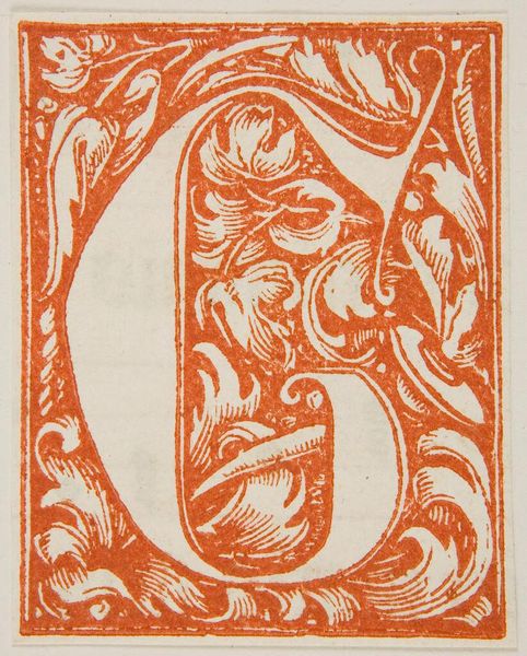
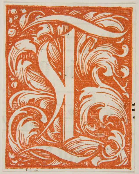
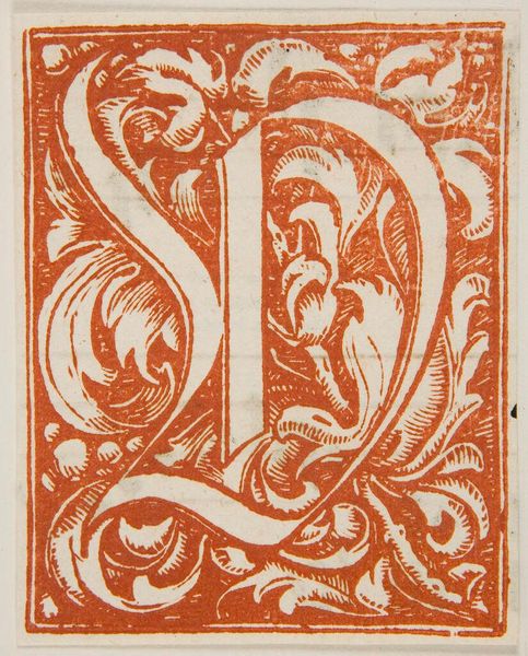
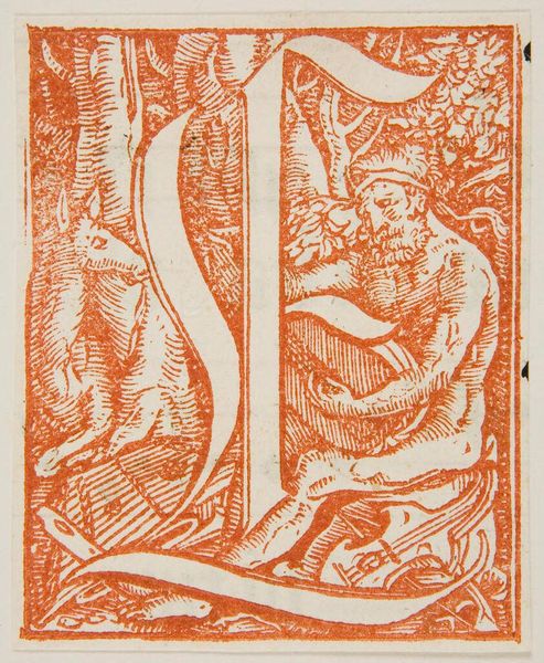
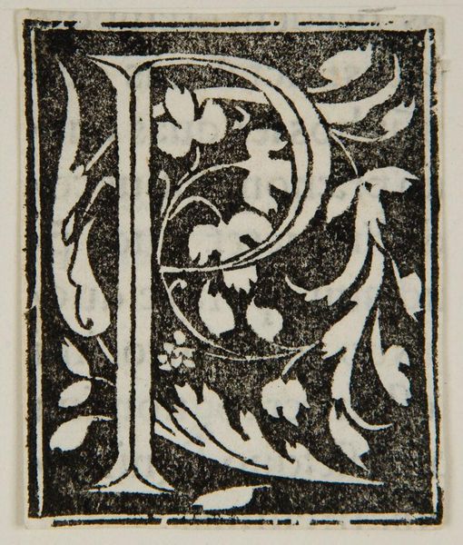
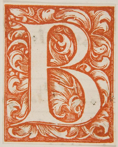
Curator: Here we have "Letter P," an intriguing example of an illuminated initial, artist unknown, residing at the Harvard Art Museums. Editor: My first impression is that its vibrancy, achieved through this striking orange hue, imbues the letter with a sense of immediacy and invitation, despite its age. Curator: Indeed. The color commands attention, but the formal complexity lies in the intricate floral patterns interwoven within the letterform itself. The use of line and the interplay between positive and negative space create a visually engaging structure. Editor: I wonder about the context in which this "P" was created. Was it part of a larger illuminated manuscript intended for an elite, literate audience, or perhaps a more accessible, vernacular text aimed at broader education? The choice of floral motifs, potentially symbolic of growth or piety, could offer clues to its original function. Curator: That's an interesting consideration. I am drawn to the formal execution, the artist's control over line and form, which speaks volumes about their technical skill and understanding of design principles, even without knowing the artist's motivations. Editor: Ultimately, whether it's about the inherent visual dynamics or the potential social implications, "Letter P" invites us to reflect on how knowledge and beauty were disseminated and experienced in its time. Curator: Yes, it is a reminder that even seemingly simple designs can hold layers of meaning and artistic intention.
Comments
No comments
Be the first to comment and join the conversation on the ultimate creative platform.
More like this