Copyright: CC0 1.0
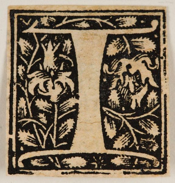
Editor: This woodcut print, simply titled "Letter T" by an anonymous artist, is quite striking. The detailed floral motifs set against the stark black ink create a pleasing contrast. What do you see when you look at this piece? Curator: The immediate impact lies in its formal elegance, wouldn't you agree? Observe the meticulous balance between positive and negative space. The rigid geometry of the 'T' is softened by the organic, curvilinear forms that surround it, creating a dynamic interplay. Editor: I do see that now. Is it common for the letters to be integrated with other images or patterns? Curator: Precisely. The letter transcends its function as mere typography; it becomes an aesthetic object. The density of the pattern work versus the simplicity of the letter 'T' creates a visual tension. Editor: I appreciate how you pointed out the tension. It makes me think about design in a whole new way. Curator: Indeed. Focusing on the intrinsic qualities of a piece reveals the artist's intent and expertise.
Comments
No comments
Be the first to comment and join the conversation on the ultimate creative platform.