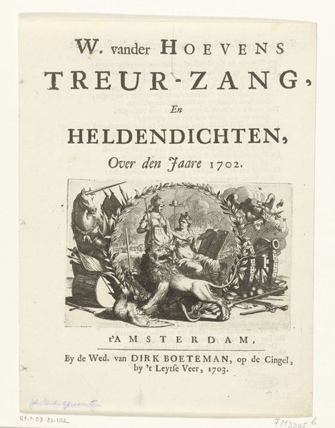
graphic-art, print, typography
#
graphic-art
#
neoclacissism
#
script typography
#
hand-lettering
# print
#
hand drawn type
#
hand lettering
#
typography
#
hand-drawn typeface
#
fading type
#
stylized text
#
thick font
#
handwritten font
#
small lettering
Dimensions: height 70 mm, width 95 mm
Copyright: Rijks Museum: Open Domain
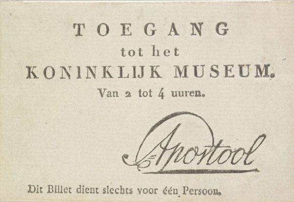
Curator: It feels rather ceremonial, almost like an invitation to a secret society. The stylized text and delicate border create a sense of exclusivity. Editor: Indeed. What we're looking at is an entrance ticket to the Rijksmuseum, dating back to approximately 1818. This particular piece falls within the realm of graphic art, specifically typography, printed on what we can presume is delicate paper stock. Curator: Typography tells its own story, doesn't it? I'm drawn to the letterforms themselves; the thickness suggests formality, yet the execution appears almost handwritten, creating a paradox of accessibility and high culture. Editor: Absolutely. In terms of historical context, the early 19th century saw the rise of national museums as tools for nation-building and civic education. The creation of a national identity hinged, in part, on making collections publicly available, albeit in a controlled and mediated way. Tickets were clearly needed for monitoring visits. Curator: Consider also that this wasn't simply about granting access; it was about shaping the experience of encountering art and history. The careful hand-lettering imbues this piece with dignity and reinforces the gravitas associated with cultural institutions. It subtly programs visitors with the expectation of what lies within, long before they set foot inside the museum. Editor: And think of the implications for those who *couldn’t* obtain these tickets. Access to museums wasn't democratized and the physical act of entering signified privilege, setting apart those ‘in the know’ from the general populace. It visually communicated hierarchies of access. Curator: This piece feels imbued with that tension. The 'fading type', perhaps through age, speaks to that ephemeral nature of access. What was once an invitation now stands as a relic – a powerful symbol reminding us about what culture excludes and who it welcomes in at any given point in time. Editor: Precisely. It invites us to question not only what is being presented but who is being given the opportunity to engage with the presentation of heritage. Looking at this humble little entrance card, you get a snapshot of society, its priorities and structures all caught in one piece of stylized script. Curator: An artwork that opens doors beyond its frame.
Comments
No comments
Be the first to comment and join the conversation on the ultimate creative platform.
More like this