Dimensions: height 210 mm, width 168 mm
Copyright: Rijks Museum: Open Domain
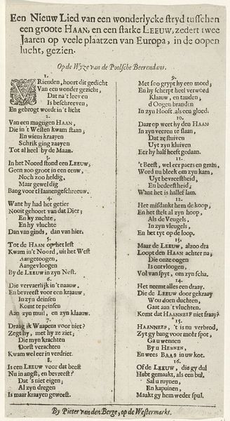
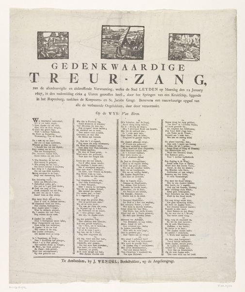
Editor: So, this print, titled "Spotvers op de Orangegezinde ouderling Pieter Joosten, 1784," created anonymously in 1784, looks like a broadside. It’s striking because it’s almost entirely text. I'm immediately curious about what it's saying, or rather, protesting. How do you interpret this work? Curator: It’s tempting to simply view this as political propaganda, but to really *see* it, we have to consider its role within the socio-political landscape of the Dutch Republic in 1784. Think about the tensions between the Orangists and Patriots. The text likely functions as a scathing commentary against a specific person aligned with the Orange faction, possibly using satire and personal attacks. Editor: So, it's not just a description, it’s an intervention? Curator: Precisely! What does the use of typography and its layout tell us? The deliberate choices in font and arrangement – the "aged paper," the "historical font" as tagged in the data—would signal specific meanings or target a certain audience during that era. How do these visual elements reinforce the text's message and further ostracize Pieter Joosten? Editor: I hadn’t considered how the lettering itself is part of the argument. So, it’s more than just the literal words, but also the way they're presented. The "thick font" and "hand drawn type" convey urgency or perhaps even aggression. Curator: Exactly. This work becomes an interesting intersection of art, politics, and social commentary. Thinking about power dynamics, consider: who had the means to produce and distribute such a print, and what does this say about the reach and influence of the anti-Orangist sentiment at the time? Editor: It’s like the design amplifies the political message, giving it more impact. I’ll definitely pay more attention to the typography and its historical context in similar works.
Comments
No comments
Be the first to comment and join the conversation on the ultimate creative platform.
More like this