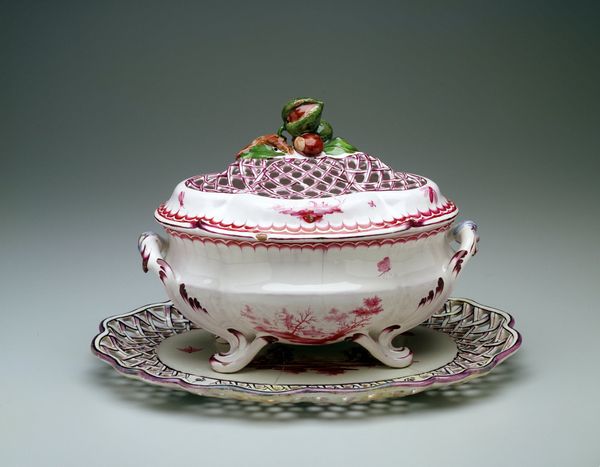
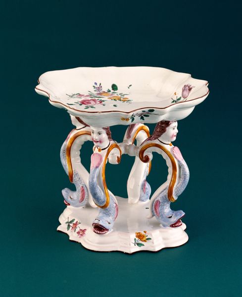
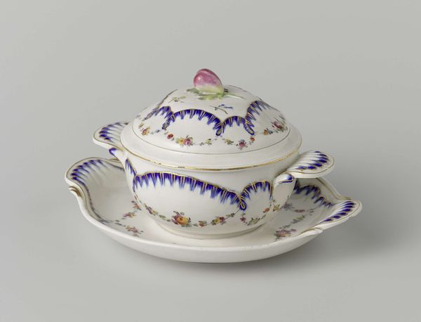
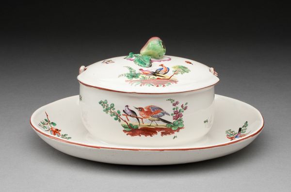
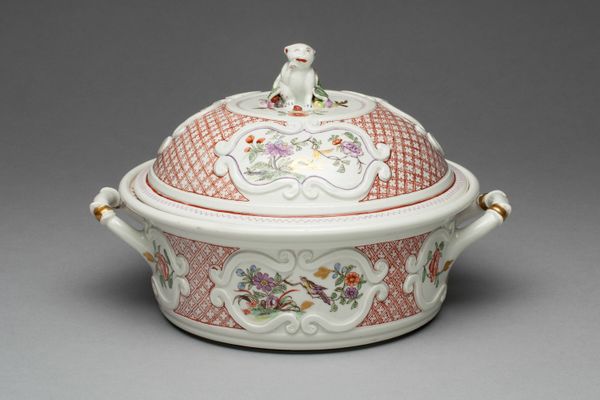
ceramic, earthenware
#
ceramic
#
earthenware
#
ceramic
#
decorative-art
#
rococo
Dimensions: 9 x 15 x 13 in. (22.86 x 38.1 x 33.02 cm)
Copyright: Public Domain
Curator: Oh my, that's delightfully...flamboyant. A bit much, honestly, like Marie Antoinette threw a dish party. What are we looking at? Editor: This, my friend, is a soup tureen and stand, crafted around 1755. It was made by Paul Antoine Hannong. We're lucky enough to have it here at the Minneapolis Institute of Art. Curator: Hannong, you say? It certainly has that rococo *thing* going on, all curves and flourishes. Earthenware, right? Not the fanciest material, but the paint job… remarkable. All those frilly details make me think of shellfish or some strange flowering aquatic creature. Editor: Exactly! The naturalistic motifs and asymmetry were classic of the time. Soup tureens were like miniature sculptures in wealthy households, symbols of status and refinement. The curves of the handles echo seashells; the stand looks like it bloomed in a coral reef. Soup wasn't just soup; it was art! Curator: But even in 1755, I have to imagine there were dissenting opinions. Like, maybe, a potter who just wanted to make a solid, practical bowl! I can appreciate the symbolic overload; the promise of nature tamed and put on the table. The colors, especially that intense pink edging everything, really get your attention, don't they? Editor: The pink, definitely a signal, screaming out wealth and artifice! Color was key to communicating status, and, for me, it triggers a specific set of reactions, from surprise, perhaps followed by admiration... or a wry amusement, but the pink is almost cartoonish. Curator: It’s interesting to think of this object as more than just a container. These extravagant designs were intentional displays of power, turning something utilitarian into an elaborate statement. A tureen less for food and more for...flaunting. Editor: Precisely. We're reading a language of symbols, translated into ceramic. And still echoing through time, asking us, 'Are we impressed yet?' I appreciate it but, from my point of view, a little bit of subversive design is nice. I bet that soup, no matter how luxurious, always tasted just a little bit of power. Curator: True. Perhaps it’s less about function and more about cultural echoes. So much extravagance simply for soup, in a world of such profound disparity and yet we're here centuries later, commenting on its exuberance! Editor: A fascinating echo, indeed. Well, next time, let’s hope it’s something a bit more… democratic? Though, I can admit there’s a strange allure to all this over-the-top craftsmanship.
Comments
No comments
Be the first to comment and join the conversation on the ultimate creative platform.
More like this