print, photography, typography, poster
#
art-nouveau
# print
#
photography
#
typography
#
poster
Copyright: Rijks Museum: Open Domain
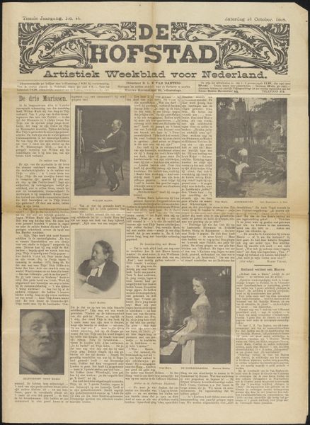
Editor: So this is *Krantenknipsel uit archief Philip Zilcken*, a newspaper clipping from possibly 1910, held at the Rijksmuseum. It’s a print combining photography and typography. I'm struck by how it blends art and information from the time. What catches your eye here? Curator: What I immediately recognize is a vessel carrying coded imagery. Look at the name *De Hofstad*. In Dutch, “hof” signifies “court” and “stad” denotes “city”. The image uses symbols reflecting the collective aspiration towards the sophistication found within urban life and royal patronage. Notice how Art Nouveau motifs intertwine with photography, mirroring the era's psychological dance between nature and industrial progress. How might readers in 1910 have perceived the blend of "high art" and news? Editor: That’s fascinating! So it's not just reporting, but shaping an idea of Dutch identity through artistic references? The artist seated at his easel is really romanticized. Curator: Precisely. Newspapers in this time weren't mere news carriers. Consider the careful choice of images - bucolic landscapes and portraits of established artists. They project the *cultural memory* and aspirations of a nation undergoing modernization. How might that image impact the *cultural memory* of artists, then and now? Is there a romantic allure to this memory that influences you as an art student? Editor: That’s something to reflect on – it really positions art as central to cultural life. This blend of photography, typography and image really elevates what would otherwise be normal print. Curator: Indeed. And by carefully examining the symbolism embedded within such artifacts, we unlock not only the era's aspirations, but also the cultural DNA that continues to shape our perceptions of Dutch art and identity even today.
Comments
No comments
Be the first to comment and join the conversation on the ultimate creative platform.
More like this