Dimensions: height 20 cm, width 15.5 cm
Copyright: Rijks Museum: Open Domain
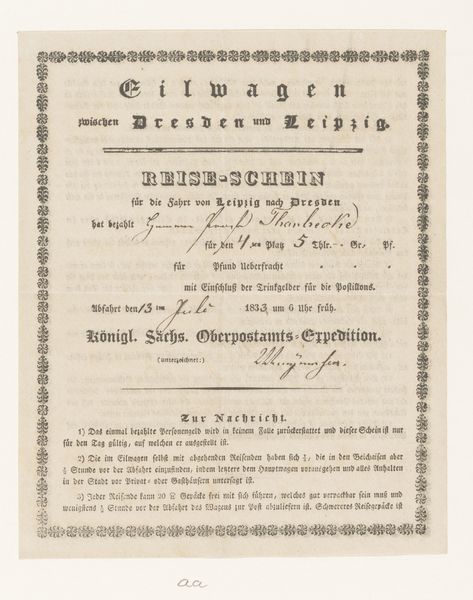
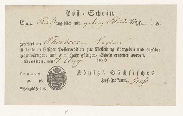
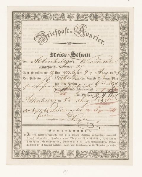
This document, a receipt from the Royal Saxon Post Office, presents a fascinating interplay between text and design. The composition is dominated by the structured arrangement of calligraphic script, announcing a fare for travel between Dresden and Nuremberg. Look closely at how the anonymous artist has used line and shape to create a formal hierarchy. Bold, larger fonts proclaim key information, while finer scripts fill in the details. The dotted border, almost like a frame, sets the document apart. The design operates semiotically, employing visual codes to communicate authority and legitimacy. Notice the use of German Fraktur script, which at the time would have been instantly recognizable and conferred a sense of officialdom. The structured layout and precise typography function together, creating a cultural artifact that is both aesthetically pleasing and deeply embedded in its historical context. The document is not merely a receipt but a signifier of its time.
Comments
No comments
Be the first to comment and join the conversation on the ultimate creative platform.
More like this