# print
#
form
#
geometric
#
abstraction
#
line
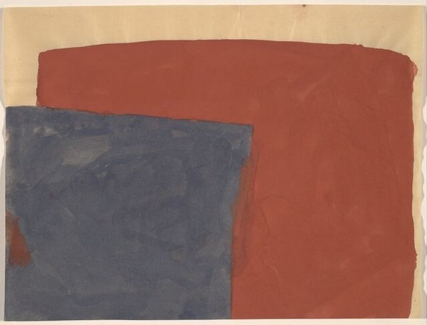
Dimensions: overall: 43.2 x 35.6 cm (17 x 14 in.)
Copyright: National Gallery of Art: CC0 1.0
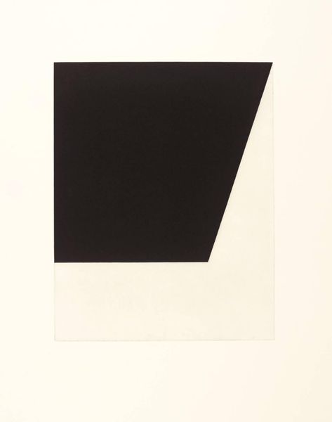
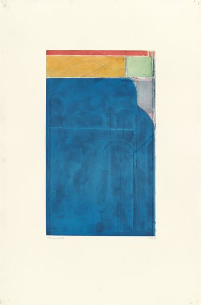
Curator: This is Kate Shepherd's "Dot Screen, Red over Blue..." created in 2001. It's a print, and what strikes me immediately is the combination of those soft, diffused colors with the stark geometry. Editor: Yes, there is an immediate visual pull created by that juxtaposition. The color choices evoke a certain coolness, almost a clinical feel. But what I find especially engaging is her exploration of printmaking techniques. Curator: Exactly. If you get closer, you can see the halftone pattern; the production becomes visible. And these colours, pink and blue, and then in relation to what she would have been producing in the 2000s – its not Pop Art’s loud aesthetic, rather more minimalist. It invites us to consider the artist's labour in creating this. Editor: The simplicity of the geometric forms—these skeletal, interior perspectives—also draws attention to the composition itself. I keep wondering if it resembles a child’s simple sketch of a corner and ceiling; it's so utterly basic. Curator: True, it almost strips bare the architectural rendering process to its core components. And knowing Shepherd's work often reflects on domestic and industrial spaces, this could be seen as a commentary on the basic structures within which we live and work. Editor: I agree, the lack of detail seems deliberate, a refusal to offer a complete picture. But I find that incompleteness captivating—it encourages the eye to move around, creating its own narratives of what space exists in or outside the colour field. Curator: Perhaps also alluding to that screen-based image production…that this isn’t a traditional pictorial space but a reproduced, and repeatable image or pattern. Editor: The interplay between the organic "dot screen" effect and these harsh lines of interior space are in conversation of form and concept. Ultimately this conversation invites the viewer to reflect on not only spatial perception but also the construction and manufacturing process that make artmaking available to consumers. Curator: Yes, by combining minimalist structure with visible means of production, she creates an unusual relationship between formal coolness and a commentary on labour and fabrication in art making. Editor: It shows how seemingly simple pieces can provoke extensive meditation on seeing. Curator: Absolutely. I keep reconsidering the relationships, and that says something about her strength as an artist.
Comments
No comments
Be the first to comment and join the conversation on the ultimate creative platform.
More like this