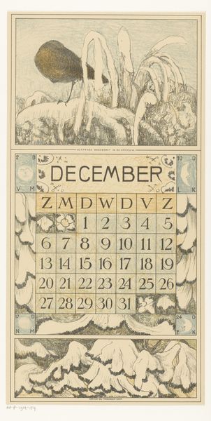
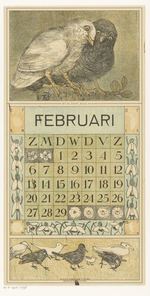
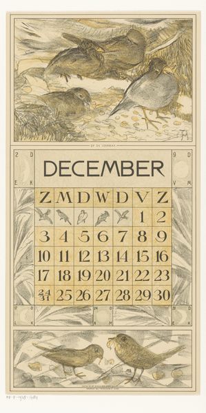
graphic-art, print, typography, woodcut, poster
graphic-art
art-nouveau
typography
woodcut
poster
Dimensions: height 470 mm, width 210 mm
Copyright: Rijks Museum: Open Domain
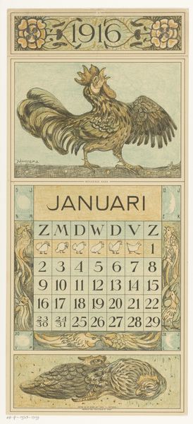
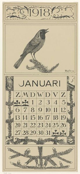
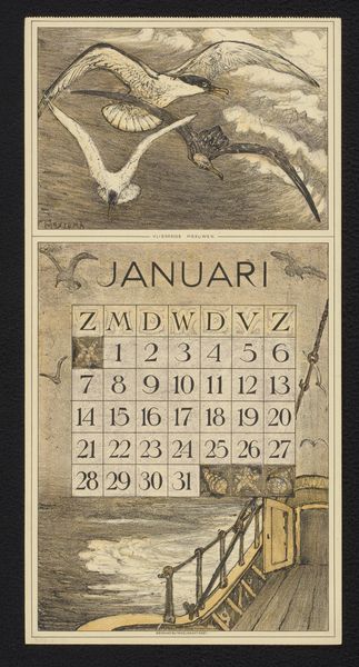
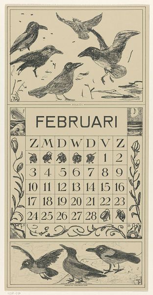
This calendar for January, made by Theo van Hoytema around 1914, is a beautiful example of how a functional object can also be a work of art. Look at the way he’s used color. It’s so muted and earthy, isn't it? Like he mixed everything with a bit of mud! I love the texture too. You can almost feel the roughness of the paper, and see the way the ink sits on the surface. If you look at the two birds at the top you can see that the marks that make up their feathers are really scratchy and textural, like he was using a really dry brush, or even scratching into the surface with a needle. It reminds me a bit of some of Audubon's bird illustrations, but with a much more personal, handcrafted feel. Van Hoytema really embraces the imperfections of the process. For me, it's a reminder that art doesn't always have to be polished and perfect. Sometimes, it's the flaws that make it beautiful.
Comments
No comments
Be the first to comment and join the conversation on the ultimate creative platform.