drawing, print, pen
#
drawing
#
art-nouveau
#
animal
# print
#
old engraving style
#
landscape
#
pen work
#
pen
#
botanical art
#
historical font
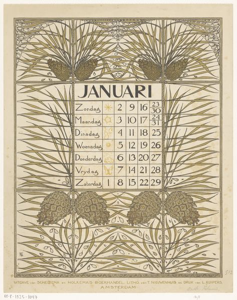
Dimensions: height 470 mm, width 210 mm
Copyright: Rijks Museum: Open Domain
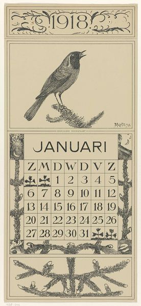
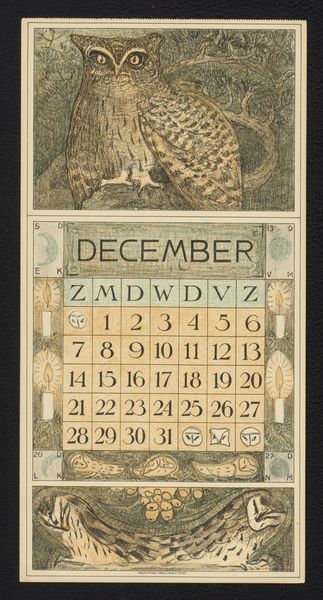
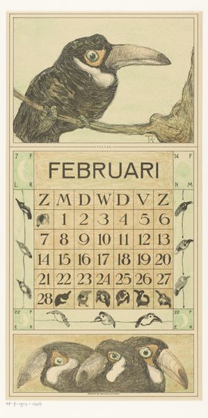
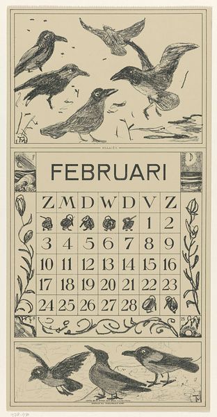
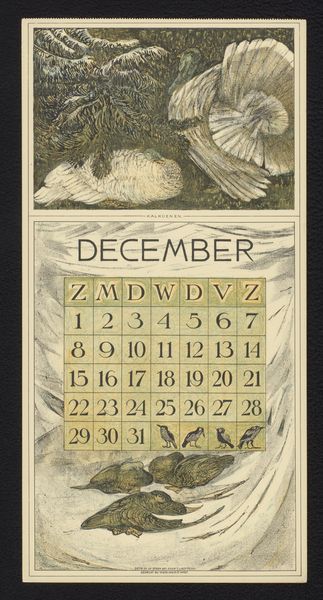
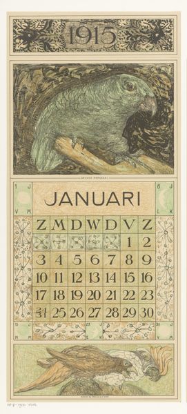
Curator: I am drawn to the stark, graphic nature of this print. Its dominant colors are very subdued; it projects a very peaceful feeling, like looking at a winter scene under an overcast sky. Editor: This is "Kalenderblad januari met kraaiende haan" by Theo van Hoytema, created in 1915. The artwork, which translates to "January Calendar Sheet with Crowing Rooster," is held at the Rijksmuseum. Hoytema was a known illustrator, graphic artist, and lithographer; this work stands as a beautiful example of the art nouveau style applied to everyday ephemera. Curator: The composition is wonderfully balanced. The rooster is centrally placed, confidently straddling the picture plane with those lovely sweeping lines that suggests the motion of it opening its beak. The calendar section below and the illustrations below add so much richness in detail and character. Editor: What interests me is the calendar’s design as a product meant for a specific audience at a certain time. Think about the social role a calendar plays. It serves as both a marker of time's passage and a reminder of the activities around us. The choice of a crowing rooster and nesting fowl as primary imagery are a perfect reflection of agricultural life and rural societies—a call to action, as well as an illustration of simple peace in slumbering through winter. The botanical frame only adds to this sensation of connecting to the landscape in that way. Curator: And there is that beautiful typeface; it provides a sort of official formality but with softer letter forms, almost rounded and softened. And this sense of order almost reminds me of the organizational impulses so popular around this period. I like how it provides not only the days of the week, but charming sketches for each. Editor: That blend of functionality and artistry speaks volumes about the intent to integrate beauty into everyday life. Also, let's note Hoytema’s choice of using prints during a period of industrial expansion in Europe. It speaks to how artists attempted to make artwork more widely accessible at a time when social hierarchies could influence access to art and artwork ownership. Curator: Overall, its simple color scheme paired with strong organic shapes, makes the artwork feel both nostalgic and timeless. Editor: Absolutely; it's a captivating lens into a time where art was seamlessly woven into the fabric of daily existence and into public culture.
Comments
No comments
Be the first to comment and join the conversation on the ultimate creative platform.
More like this