Dimensions: height 418 mm, width 212 mm
Copyright: Rijks Museum: Open Domain
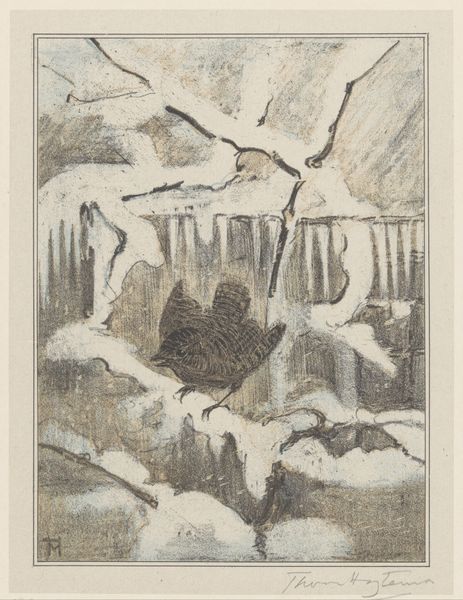
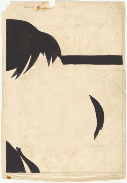
Theo van Hoytema made this calendar page for January 1912 with ink and graphite, I imagine, because of the beautiful matte surface and tonal range. It’s that end-of-the-year moment when artists are thinking about setting intentions. Hoytema combines the practical with something a little more poetic. Look at how the gulls are drawn, they're both precise and a little scratchy, almost vibrating on the page. There’s one diving down in the top left and you can really feel the weight of its body, like the graphite is catching on the tooth of the paper, creating both texture and shadow. It really emphasizes the physicality of drawing, how the hand moves across the surface. Hoytema was interested in lithography and graphic design, he made a lot of calendar designs like this one. The sparseness and fine detail remind me a little of M.C. Escher who was born about 3 years before Hoytema; both artists have a similar talent for observation and for technical precision. The way the composition is divided here – the sea, the gulls, the calendar, the ship – seems to invite many readings and interpretations.
Comments
No comments
Be the first to comment and join the conversation on the ultimate creative platform.
More like this