graphic-art, print, engraving
#
graphic-art
#
baroque
# print
#
old engraving style
#
history-painting
#
engraving
Dimensions: height 83 mm, width 200 mm
Copyright: Rijks Museum: Open Domain
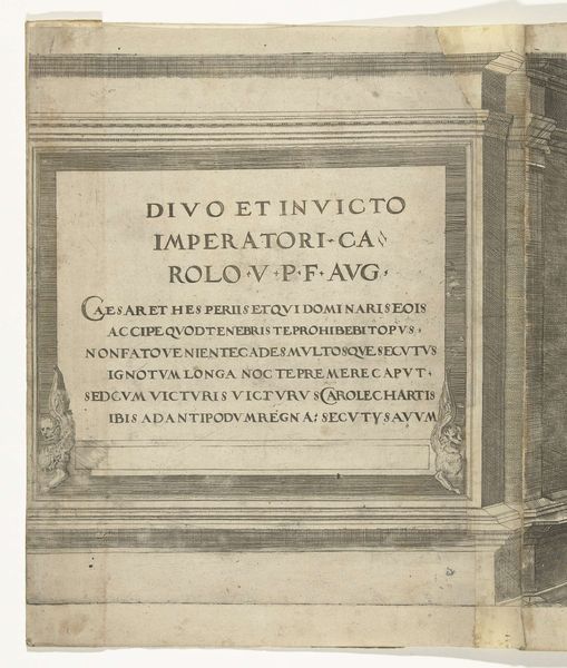
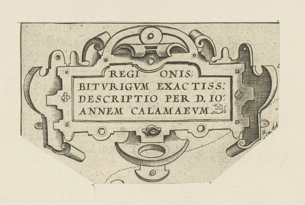
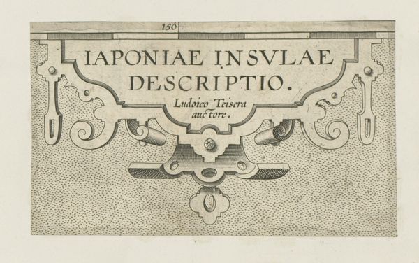
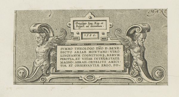
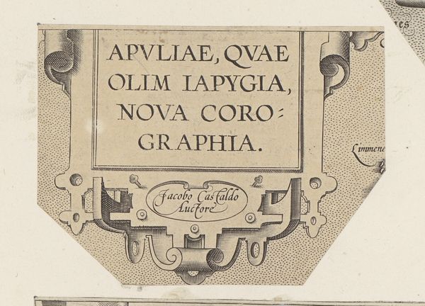
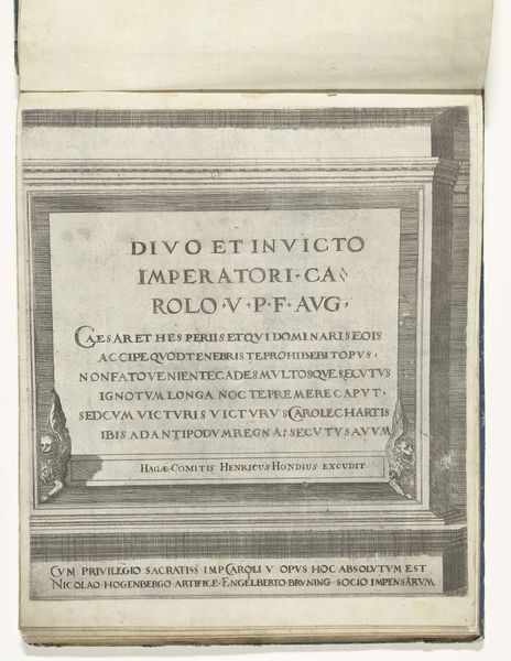
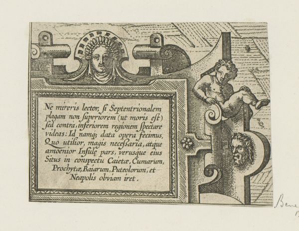
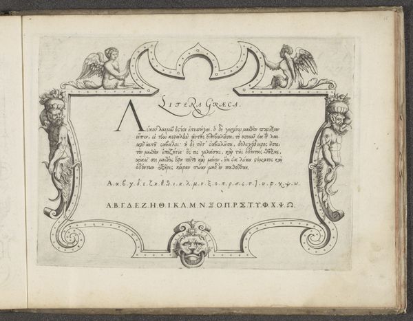
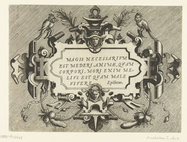
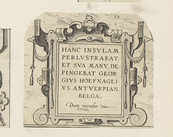
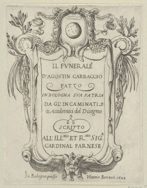
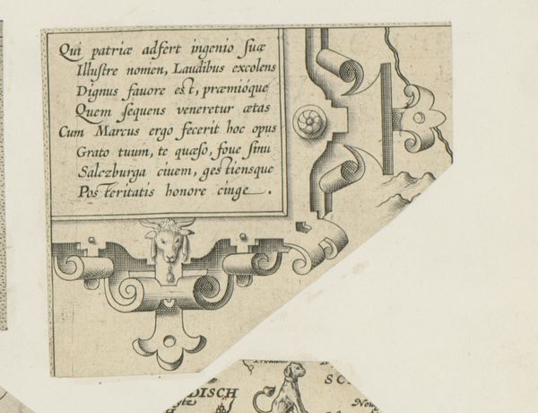
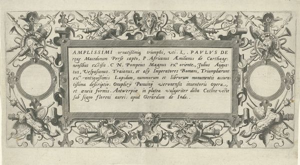
Curator: Looking at "Titelpagina voor: Diversa Aedificia, 1658" from the Rijksmuseum, immediately, the meticulously wrought lines create a sense of precision. Its texture, while captured in print, seems almost tactile. Editor: This engraving by Pieter de (II) Jode serves as the title page for a series depicting diverse buildings. It uses a baroque style with prominent architectural details in the frame. The interplay of classical elements creates an immediate visual structure that demands attention. Curator: Note the inscription; it highlights the act of sculpting itself. Jode foregrounds his technical skill, positioning himself within a lineage of artisans mastering materials. How do you think that placement influenced the reception? Editor: Interesting you point out the materiality through this mention of "sculpta," the sculpting process, indicating not just design, but crafted object-making. The labor involved in engraving and printing these images had a substantial impact on architectural knowledge dissemination and consumption, rendering it more accessible and reproducible. Curator: Indeed, and beyond that practical consideration, consider the visual impact. The balanced asymmetry of the flourishes framing the text is particularly Baroque; the heavy line work and the detailed depiction creates an illusion of depth that is compelling even today. Editor: Yes, it's more than just dissemination; it's the commodification of architecture, its distillation into easily transportable images—a shift that affected building practices themselves. Did widespread prints alter building design and aesthetics for consumption? Curator: Fascinating. Perhaps viewing this less as documentation, and more as marketing shapes understanding? In this image, the focus is clearly directed, utilizing negative space around the central text block—its pure intent and layout commands attention. Editor: Yes, reframing from merely a record of architecture, or even mere dissemination into thinking about the processes and economic drivers shows the means in ways that a formal appreciation would not, doesn’t it?
Comments
No comments
Be the first to comment and join the conversation on the ultimate creative platform.
