print, metal, engraving
# print
#
metal
#
pen sketch
#
old engraving style
#
form
#
geometric
#
line
#
northern-renaissance
#
decorative-art
#
engraving
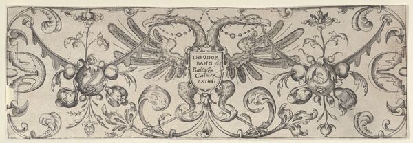
Dimensions: height 77 mm, width 122 mm
Copyright: Rijks Museum: Open Domain
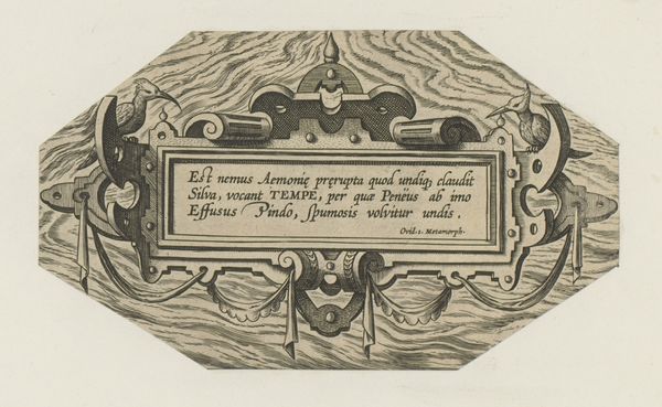
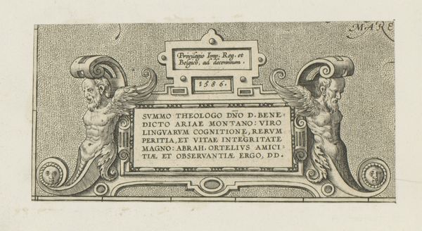
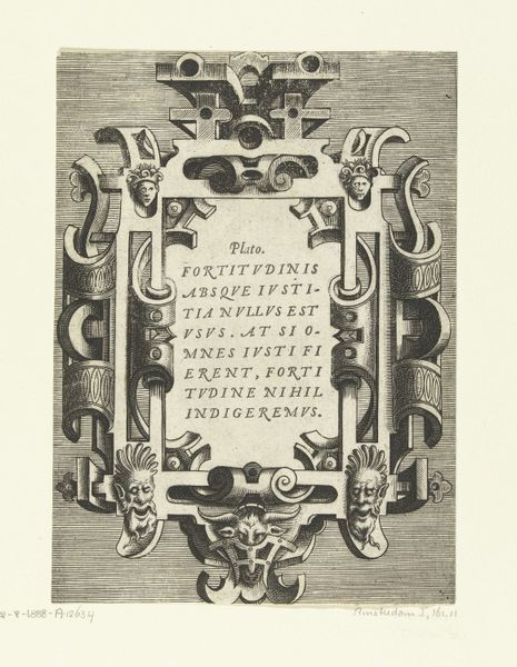
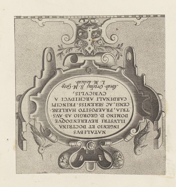
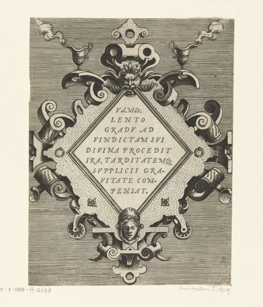
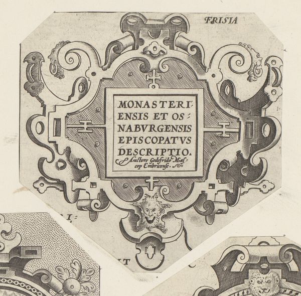
Curator: Right now, we're looking at a print called "Rechthoekige cartouche met rolwerk," or "Rectangular Cartouche with Scrollwork," from around 1570. It's an engraving done in metal. Quite precise and wonderfully evocative of its era! Editor: Evocative is right! It feels so stiff and formal. Like something a very serious bureaucrat would have hanging in their office, albeit one from the 16th century. It just screams order, doesn’t it? Curator: I can see that! But to me, the appeal lies in its inherent order, it's so typical of Northern Renaissance decorative arts with its focus on intricate line work and geometric shapes. And notice how the form of the cartouche is, itself, the primary subject. It doesn't frame a picture or scene; it *is* the picture. Editor: Absolutely. The lines *are* meticulous and create a really fascinating, if a bit sterile, design. You've got your basic rectangle, but then these wild flourishes erupt around it – almost like the bureaucracy is barely containing some chaotic energy. Look at those stylized scrolls. Curator: I love that you see them that way! It suggests the tension between the controlled, geometric world and the exuberant natural world – very typical of the era when the Renaissance was hitting Northern Europe, the decorative arts like this reflected newfound freedom from religious oppression. Editor: Yes! The material itself – an engraving on metal – lends to that feeling. There's a coldness there, a permanence. Everything’s so deliberately etched and, well, *fixed*. Does the Latin text offer any insight into its rigidity? Curator: Well, the text translates roughly to "An Accurate Description of the Region of Bourges by D. Ioannes Calamaeus" suggesting it may have been a title cartouche intended for a map! Bourges, in France, was an important historical area and the name of the engraver is proudly put front and centre. So this "artwork" would likely have a very useful and practical beginning to it. Editor: So not an aesthetic choice *per se*, which also fits nicely within our assessment of form versus expression, structure over fluidity. Curator: Precisely! It makes you appreciate the layers of context behind even the most seemingly straightforward of artworks. Editor: Agreed. Makes you wonder what other hidden stories and intentions lurk within these silent witnesses to history.
Comments
No comments
Be the first to comment and join the conversation on the ultimate creative platform.
More like this