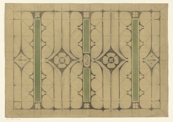
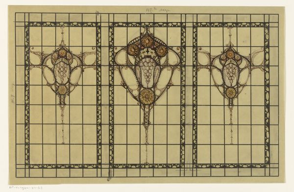
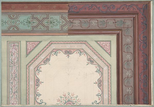
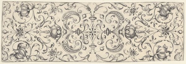
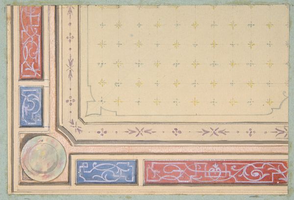
drawing, mixed-media, paper, ink, mural
#
drawing
#
mixed-media
#
art-nouveau
#
paper
#
form
#
traditional architecture
#
ink
#
geometric
#
decorative-art
#
mural
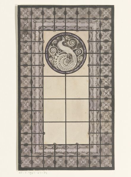
Dimensions: height 153 mm, width 227 mm
Copyright: Rijks Museum: Open Domain
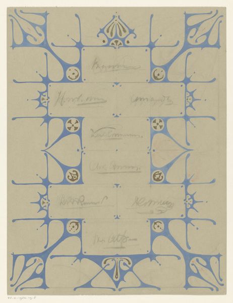
Curator: The symmetry is quite striking, isn’t it? It feels very composed and almost mathematical in its precision. Editor: It’s interesting that you say that, because I immediately see something whimsical in its Art Nouveau style; that sinuous linework gives it an organic quality. This is a mixed media piece on paper, likely after 1907, entitled "Ontwerp voor een glas in loodraam met een vis" or “Design for a stained glass window with a fish.” Curator: The way the geometric forms structure the composition does create a sense of underlying order. The grid and the placement of the floral-like motifs, and particularly the diamond framing the central fish, emphasize a structured visual experience. Editor: It does, yet that rigid grid would have been filled with colored glass, transforming its reception within the spaces it would occupy. Stained glass, after all, was used for its decorative purposes to give churches a mystical aesthetic with bright light. I wonder how this fish would resonate with various religious communities at that time. Curator: Yes, if one takes into consideration that the fish is frequently considered a traditional Christian emblem. Focusing on the formal choices, the artist emphasizes a play between containment and release: The central image, and others in each quadrant are trapped in place with ornate embellishment. Editor: Considering the era, the fish could also be interpreted as an allusion to naturalism and Darwinism, a then burgeoning interest and area of research, framed by increasingly ornate, commercially viable “art for art’s sake.” Art Nouveau was so heavily consumed, mass produced. I feel as though I could go buy this pattern for my own kitchen today. Curator: Indeed! The flattening of the image, almost akin to an abstracted logo, reinforces its nature as reproducible. What do you make of the color choices? The purple and light blue seem purposefully muted and elegant. Editor: In the original glasswork it would certainly feel elegant! Knowing that these hues are far from naturally occurring, I believe the muted palette speaks to the aspirations of the Art Nouveau movement itself. Curator: Interesting! So the visual order and limited colors signal… Editor: Perhaps, a kind of refined accessibility. In any case, I’ve thoroughly enjoyed diving into the piece! Curator: As have I! There are levels to explore with the work.
Comments
No comments
Be the first to comment and join the conversation on the ultimate creative platform.
More like this