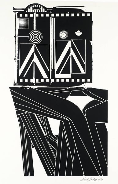
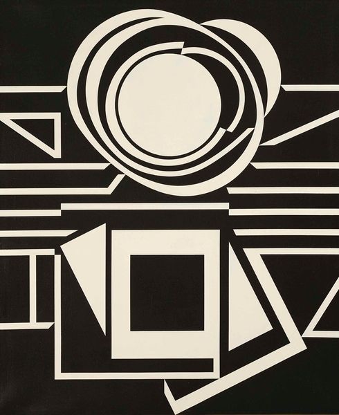
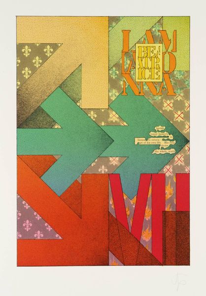
typography, poster
#
typography
#
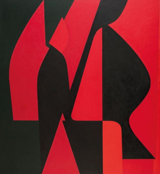
pop art
#
typography
#
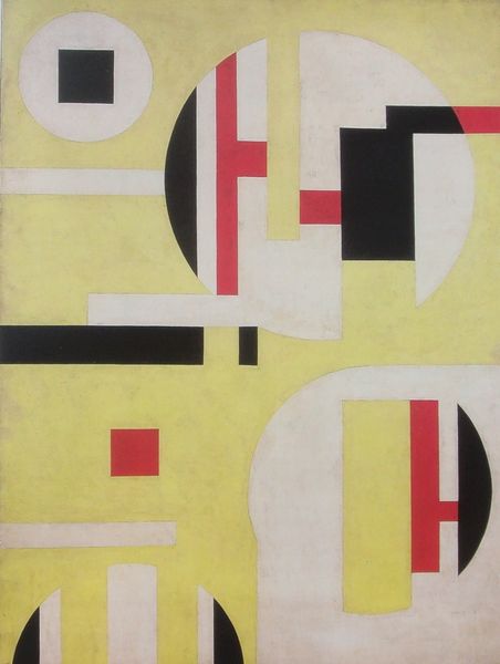
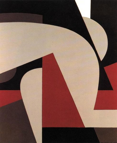
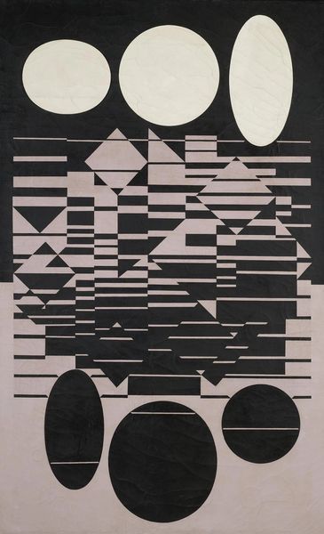
geometric
#
pop-art
#
poster
Copyright: Modern Artists: Artvee
Editor: This is Roy Lichtenstein's 1968 poster, "Merton of the Movies," created with typography. It feels like such a deliberate breakdown of form – what do you see in this piece? Curator: For me, the key to this poster lies in its reproduction. Lichtenstein wasn't just designing; he was thinking about the industrial printing process, particularly offset lithography. He mimicked the Ben-Day dots to achieve the stippled gray, pushing the boundaries of what was considered 'high art' by adopting these very commercial printing techniques. Editor: So the actual method of production is crucial to understanding it? Curator: Absolutely. It's a challenge to traditional notions of artistic skill. He uses graphic elements and standardized typography almost like pre-fabricated pieces. Think about how that speaks to the burgeoning consumer culture of the '60s, where mass production and design intersect. Consider this poster's functionality, it's promoting a play - how might its aesthetic influence attendance? Editor: That's interesting. It does feel very…accessible because it seems familiar due to its reference to consumer culture and production processes. Curator: Exactly! He blurs the line between advertisement, commercial design, and fine art. It forces us to question the value we place on hand-made art versus mechanically reproduced imagery. Where is the 'art' residing, in its initial design, its recontextualisation, its reception by the public, its impact as a commodity? Editor: I see what you mean. It shifts the focus from the artist's hand to the cultural and economic forces at play in its creation and consumption. Curator: Precisely! Looking at it now, I am seeing all the more, how much it holds beyond the purely visual. Editor: It certainly gave me a new appreciation for process and the cultural implications of how art is made and circulated.
Comments
No comments
Be the first to comment and join the conversation on the ultimate creative platform.
More like this