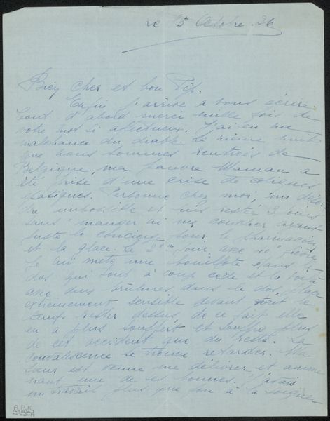
drawing, paper, ink
#
portrait
#
drawing
#
pen illustration
#
paper
#
personal sketchbook
#
ink
#
calligraphy
Copyright: Rijks Museum: Open Domain
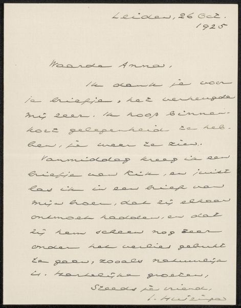
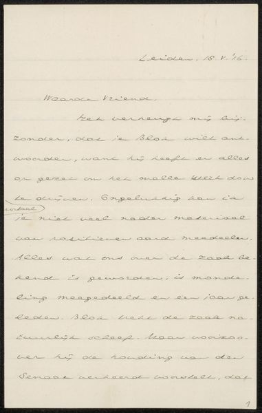
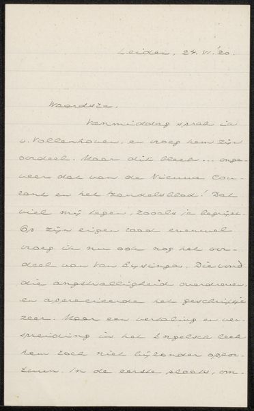
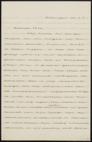
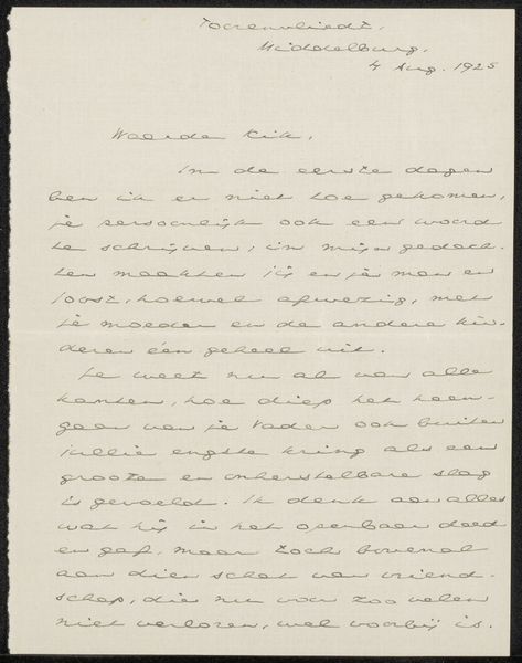
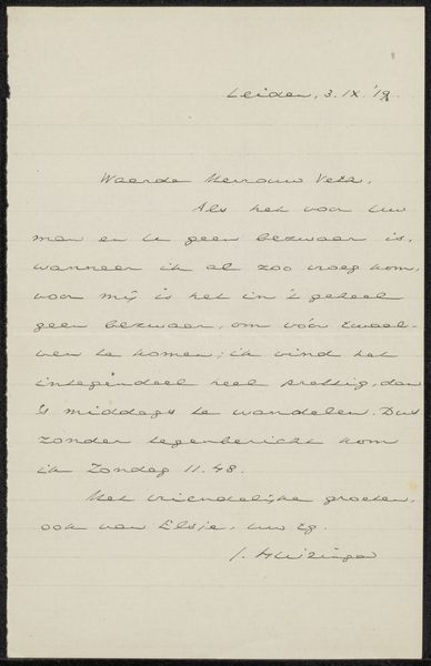
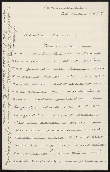
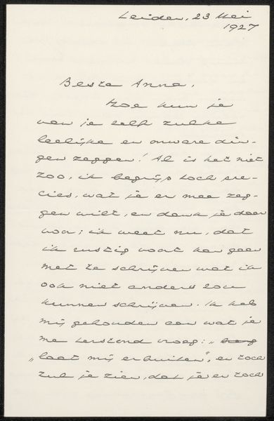
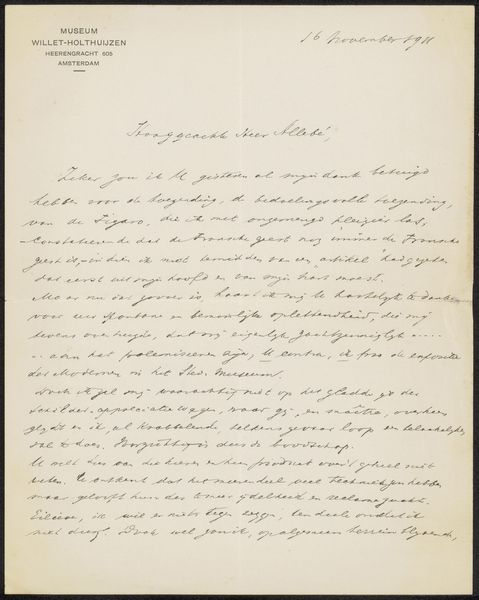
Curator: This drawing, "Brief aan Anna Dorothea Dirks en Jan Veth," is believed to have been created around 1922 or 1923 by Johan Huizinga. It's ink on paper. Editor: It's immediately striking how intimate it feels, a glimpse into someone's personal correspondence. The script dominates, the dark ink flowing across the page. It feels almost like a visual representation of thought itself. Curator: Indeed. As a historian, what interests me most is the context surrounding this letter. It reveals Huizinga's personal network, the individuals with whom he corresponded and shared his ideas. Letters like these offer invaluable insights into the social and intellectual circles of the time. Editor: From a purely aesthetic point of view, it's fascinating how the rhythm of the writing creates a unique composition. Notice how the density of the lines varies, creating a sense of light and shadow. The negative space around the text is just as important. The formal arrangement contributes a great deal to the artwork's emotive capacity. Curator: Precisely. This letter, beyond its personal nature, showcases the conventions and etiquette of correspondence in the early 20th century. The handwritten form speaks to a time before digital communication, highlighting the importance of penmanship and the personal touch it conveyed. This speaks to the public role this private correspondence occupied in a period when interpersonal communications required a certain type of performance and even theatricality. Editor: And yet, the irregularity of the handwriting also brings a level of emotion. The varying pressure of the pen on the paper… look at the downstrokes…it all gives a kind of personal expression absent from perfectly printed type. We feel the hand that wrote this. Curator: Absolutely. Letters serve as historical documents, providing a unique window into the lives, relationships, and cultural values of the past. Thanks to the work, we are invited into an intimate discourse within a bygone era. Editor: Looking at its composition, the contrast of black on white is so arresting, the marks so pronounced. Its emotional tenor feels elevated and solemn, making it an artifact with much to communicate to its viewers.
Comments
No comments
Be the first to comment and join the conversation on the ultimate creative platform.
More like this