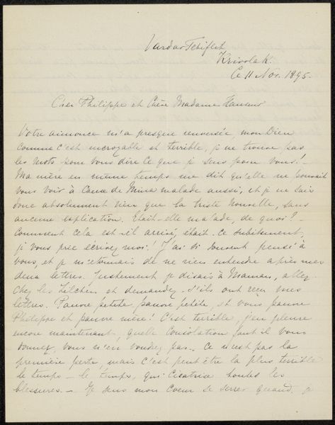
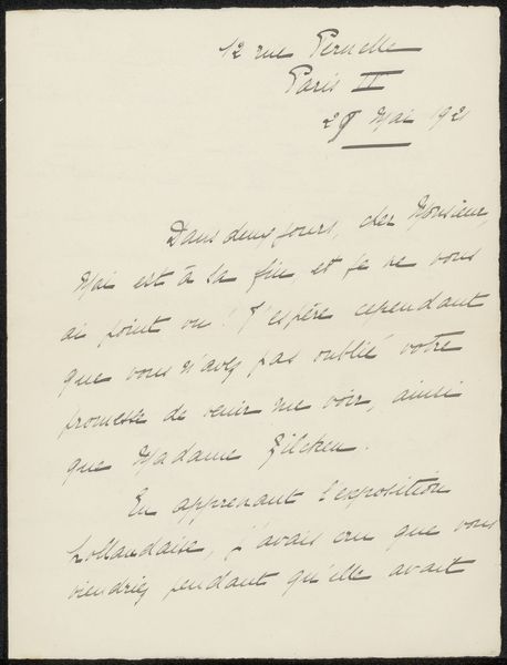
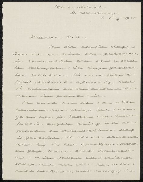
drawing, paper, ink
#
drawing
#
ink paper printed
#
hand drawn type
#
paper
#
ink
#
calligraphy
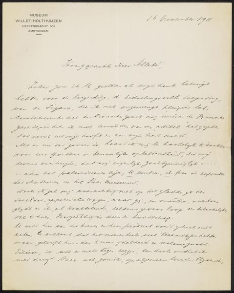
Copyright: Rijks Museum: Open Domain
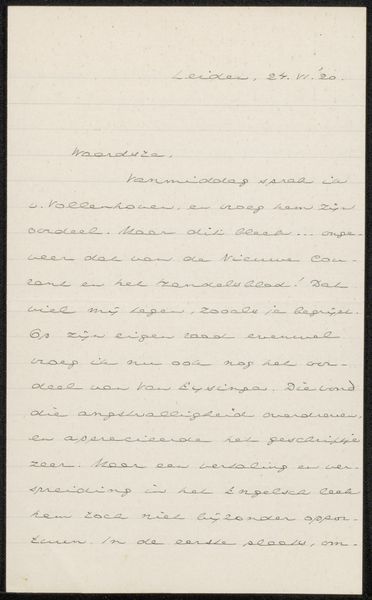
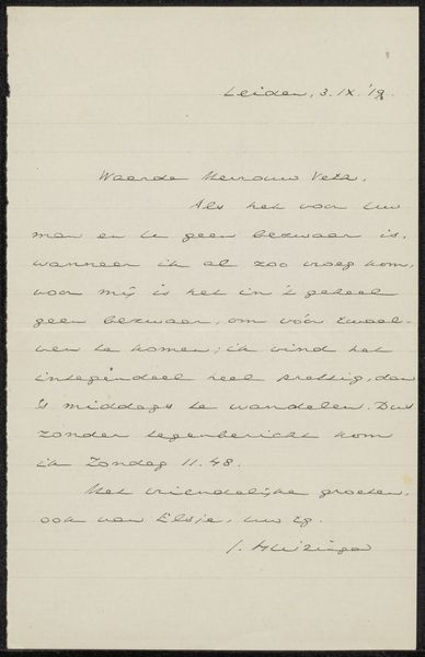
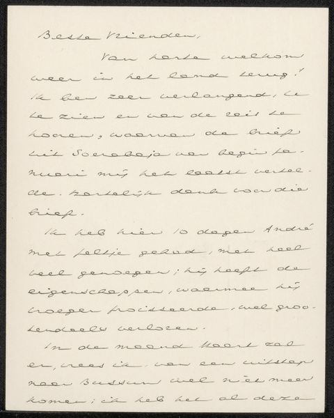
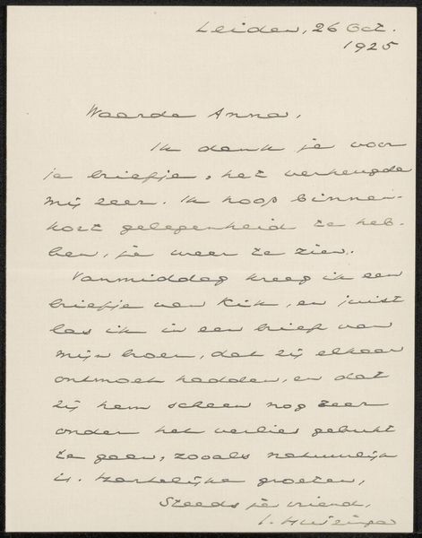
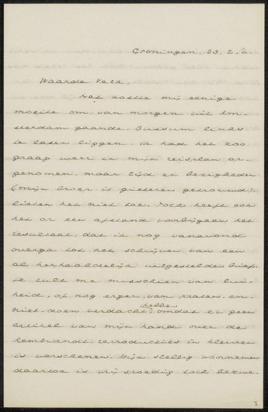
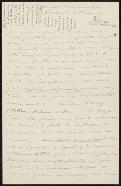
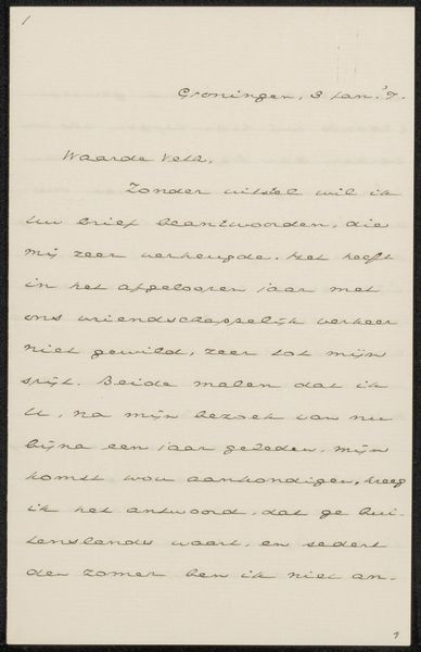
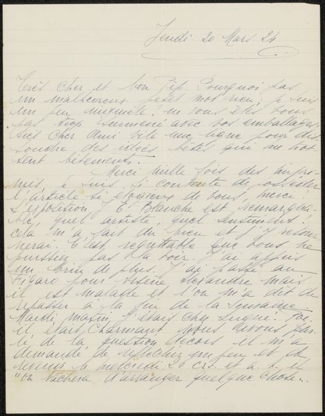
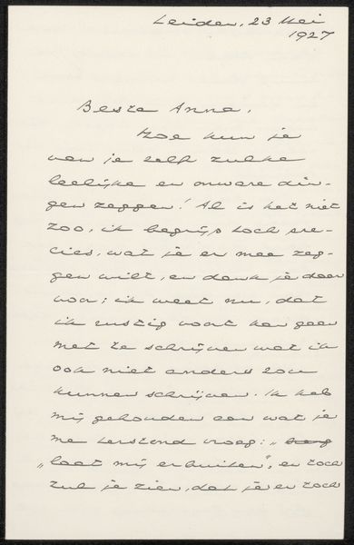
Curator: Looking at Johan Huizinga’s "Brief aan Jan Veth," likely from 1916, crafted with ink on paper, I’m immediately struck by the intimacy it holds. Editor: It does have that handwritten feel. It looks like a simple letter, but the script itself has such a presence. How do you read the symbolism embedded in something seemingly so straightforward? Curator: I see the script itself as a potent symbol. In this calligraphic form, it transforms into a visual representation of thought and intention, holding the weight of the message. Think about how each stroke is a deliberate act. Each carefully formed word is like a symbolic gesture in itself, building meaning through repetition and form. Can you feel how Huizinga’s thoughts seem to inhabit the very materiality of the letter? Editor: Yes, I see that now. So it's not just the content of the letter, but the very act of writing and the visual form it takes that are meaningful? Is the artistic value then more cultural rather than stylistic? Curator: Exactly. Consider the era - 1916, amidst the First World War. This letter, this carefully inscribed message, stands in stark contrast to the mechanized horrors unfolding across Europe. The personal touch, the human connection, become defiant acts of preservation, preserving a sense of order and shared humanity amid chaos. Editor: That makes so much sense! Seeing it in the context of the war really illuminates the deeper meaning behind such a simple form. Thanks for making it so clear! Curator: And thank you for your insightful questions; it helps bring this moment back to life.
Comments
No comments
Be the first to comment and join the conversation on the ultimate creative platform.
More like this