graphic-art, print, paper, typography, poster
#
editorial cover design
#
script typeface
#
graphic-art
#
sand serif
#
aged paper
#
parchment
# print
#
gold leaf
#
paper
#
typography
#
fading type
#
thick font
#
golden font
#
letter paper
#
poster
Dimensions: height 275 mm, width 211 mm
Copyright: Rijks Museum: Open Domain
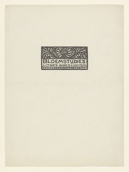
This letterhead from the De Kroon print shop in Hilversum is so fresh and clean. The design is minimal, all about clear communication, which I appreciate. There's something about the simple layout, the restrained use of color - just that touch of purple in the crown logo and the border - that speaks to me. It’s like the visual equivalent of a well-written sentence. The paper itself has a warm tone, like old newsprint. The typography is so satisfying. It reminds me that art isn't just about grand gestures or wild expressions; it's also about the quiet, thoughtful choices we make every day. That purple crown, with its little details, it’s like a drop of color in a sea of white. It reminds me a bit of the work of someone like Agnes Martin, who could do so much with so little. It's all about balance, about finding beauty in the ordinary.
Comments
No comments
Be the first to comment and join the conversation on the ultimate creative platform.
